Fortera Rebrand (Personal)

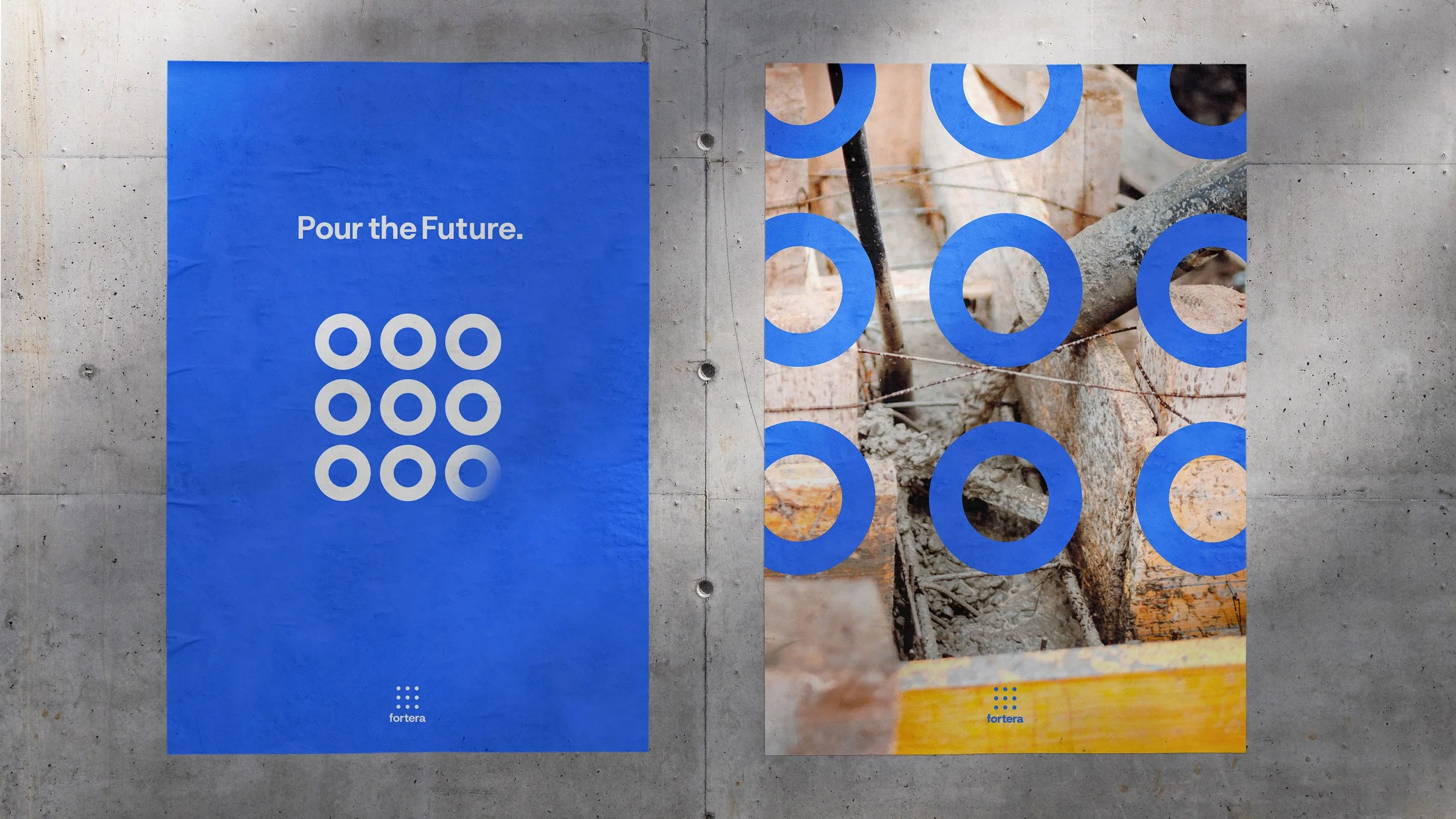
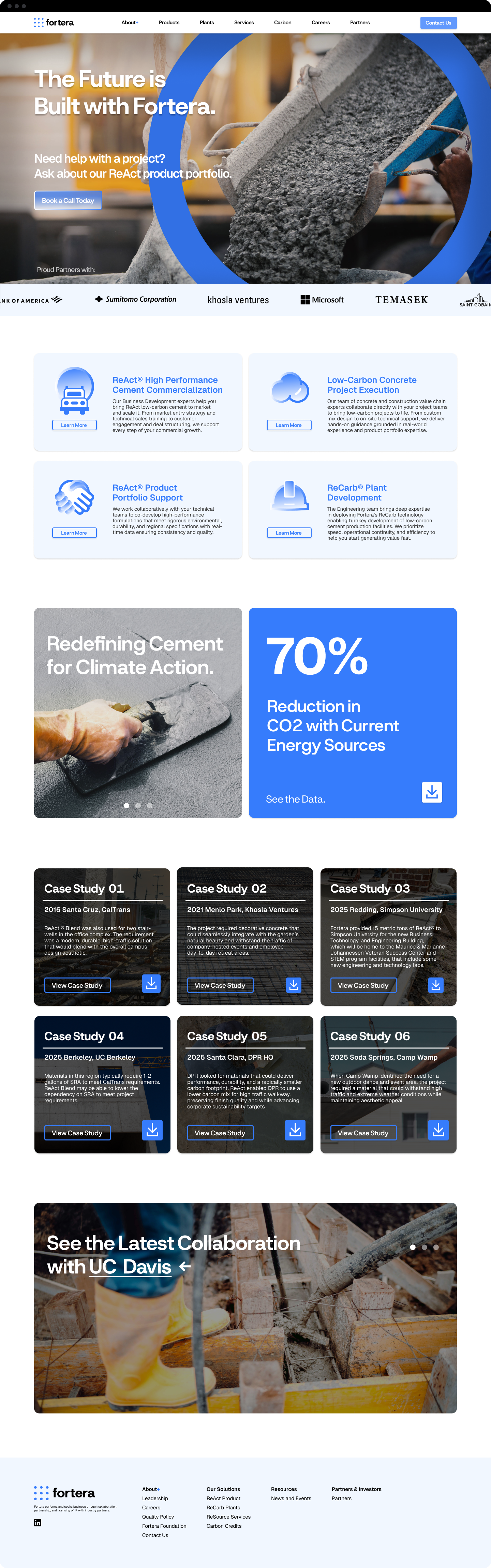
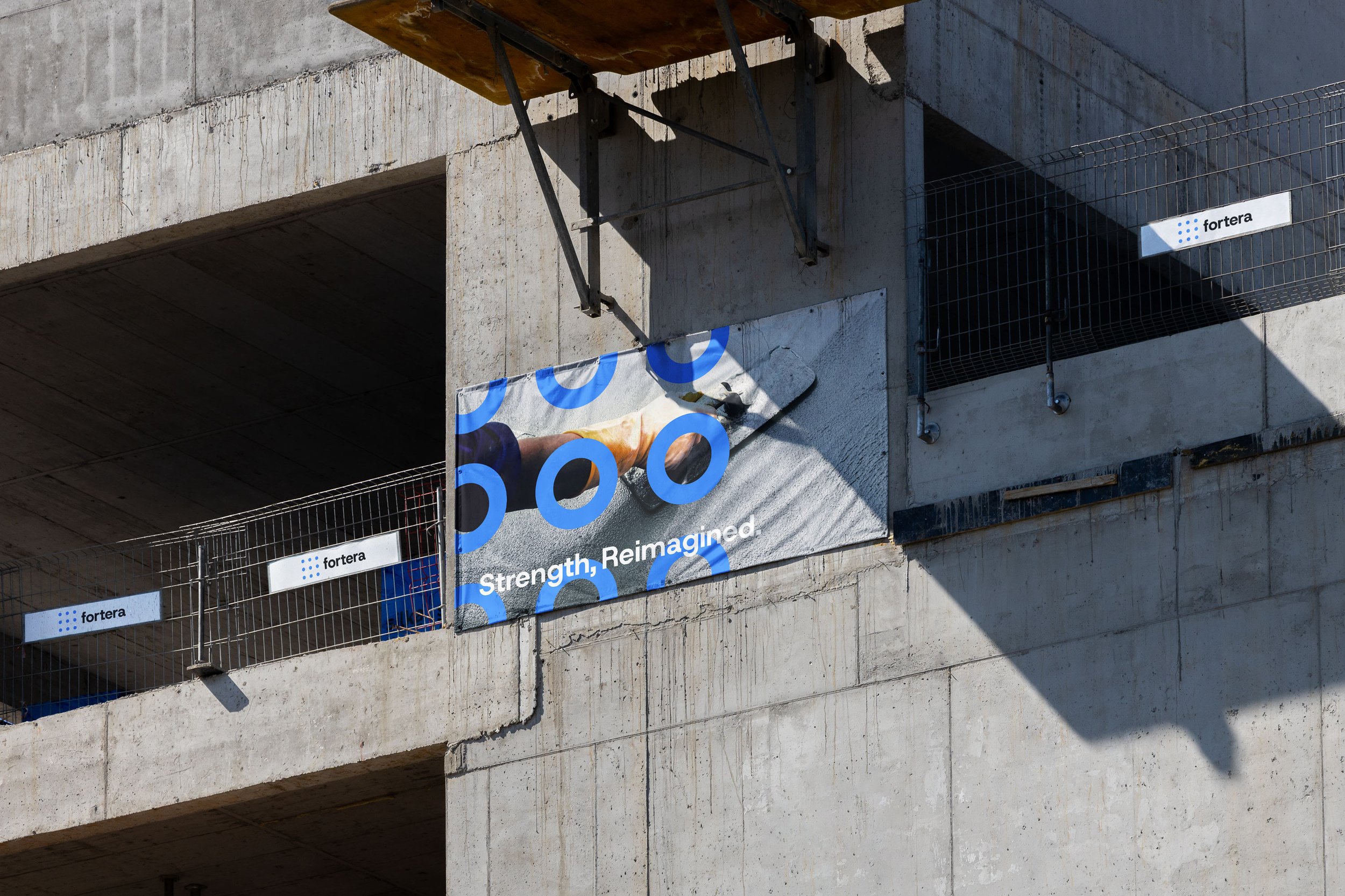
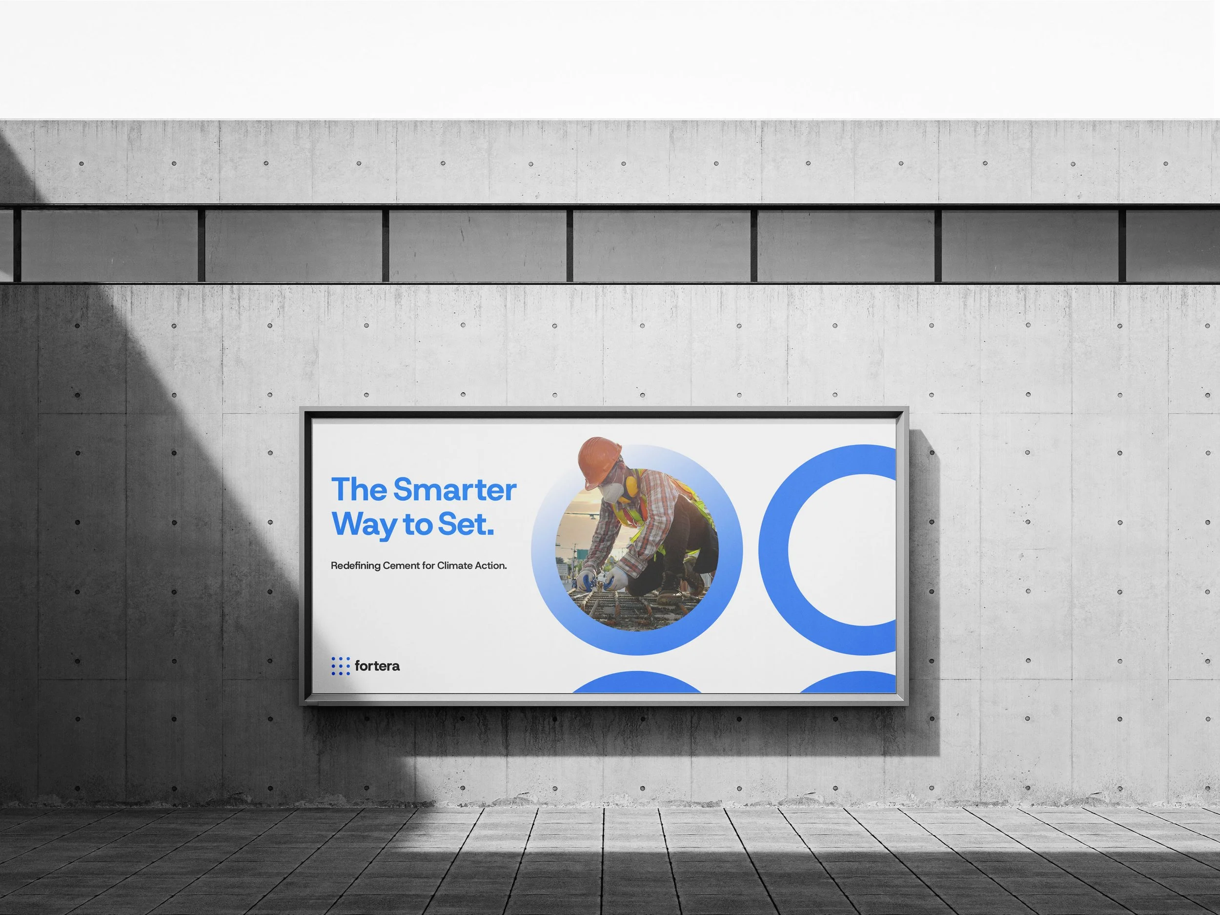
During my time at Fortera, there felt a point where a rebrand was a possibility. I spent my own time designing and envisioning the potential brand evolution. I took into consideration the growth and strategy of becoming industry leaders and disruptors in cement decarbonization.

My Role

Logo, Branding, Visual Identity, Website, Iconography

My Team

Michael Chen - Graphic Designer

The rings are indicative of the tie holes seen on cement slabs where the purpose is to allow the slab to be transported and tightly secured.

The royal blue color palette suggests trust, clarity, and confidence in the research and technology’s mission to decarbonizing cement.