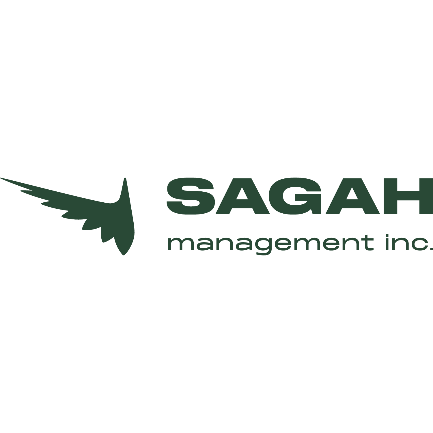
Sagah Management
A logo design project that included print deliverables. Rooted in the Hebrew word for “increase,” Sagah Management was positioned as a growth-focused, real estate management company. A peacock served as a symbol of prosperity, reinforcing the company’s ambition. This also created a sophisticated and professional visual.
My Role
Logo, Print
My Team
Michael Chen - Logo Designer
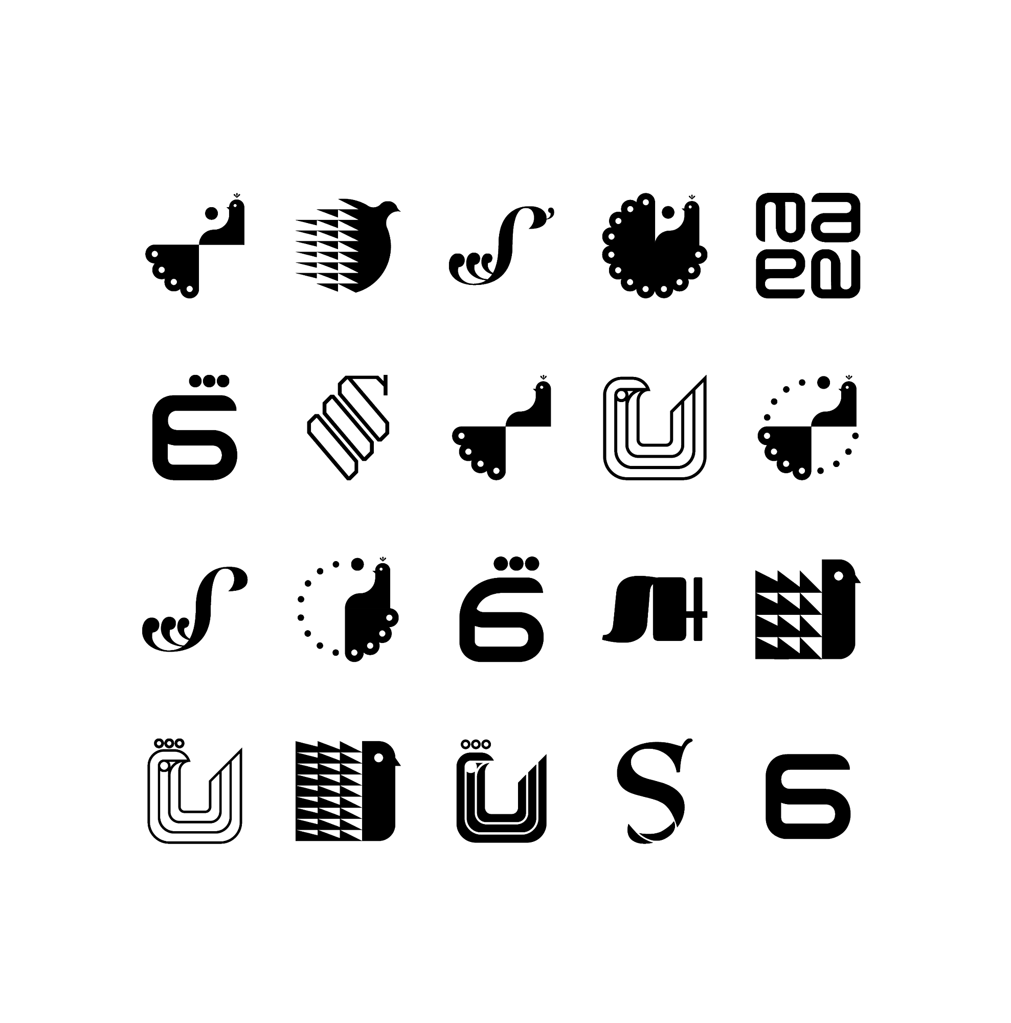
We explored a variety of peacock designs before arriving at the final visual style.
The clients were open to me exploring different ways of expressing their mark. This gave me the opportunity to come up with different approaches as they wanted to see a variety of styles before deciding on the final look.
Having Fun With It.
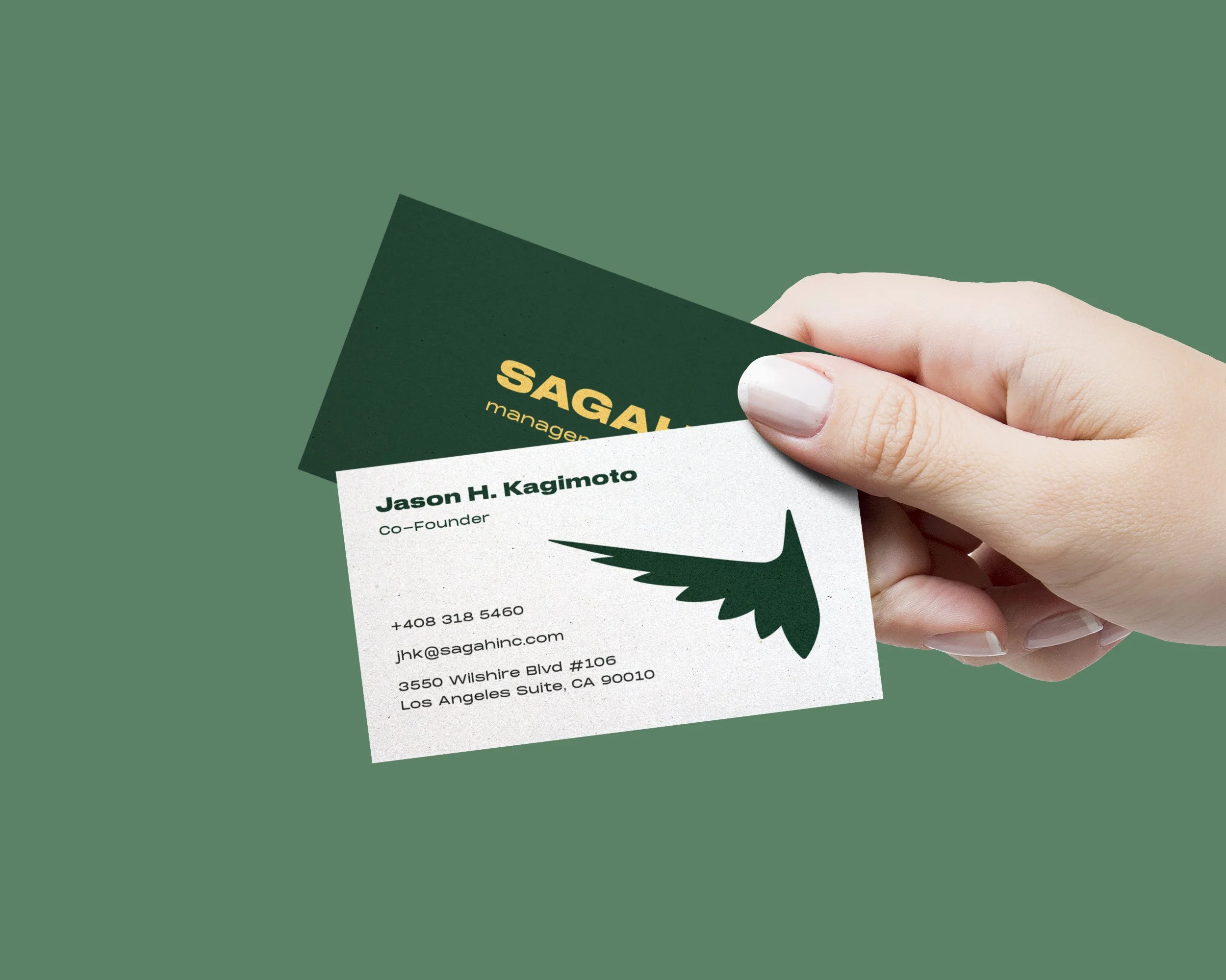
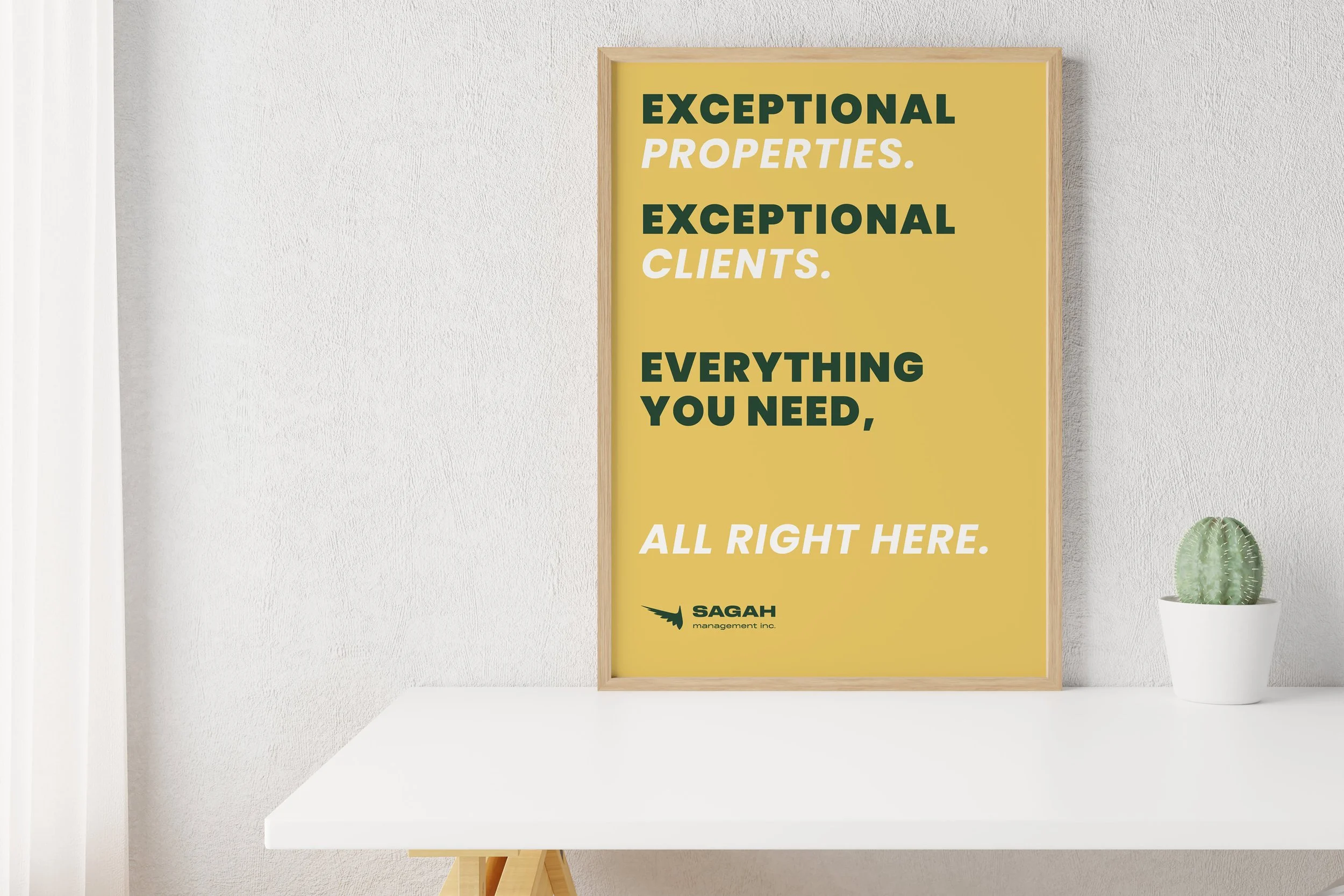
I provided these mockups for them as options to further apply their mark and start defining their brand. In the end they were happy with the final logo and decided to add a set of business cards.