At AMAX, I created social media posts and sales collateral that supported the company’s marketing and sales efforts. Toward the end of my time there, I took on a larger project: redesigning the company’s website. I developed two distinct design options for the team to review.
Team
Michael Chen - Graphic and Website Designer
Mannong Pang - Web Developer
Illustrator
Figma
Brief
The design should establish a clear visual hierarchy, simplify navigation across product lines and industries, and reflect a modern, credible brand suited to enterprise IT buyers, engineers, and technical decision-makers.
The Challenges
AMAX wanted to refresh its visual style beyond what the established brand guidelines covered.
AMAX is an AI infrastructure company focused on deployment, and its website was text-heavy, which made key information hard to scan.
With limited time left on the project, I delivered a homepage visual direction the team could build on.
Pinpointing Issues
The project had no visual references and no formal review process.
Much of the site’s information was outdated.
Several rounds of manager approval were needed to decide what to cut and what to keep.
The Solutions
Prioritized a more modern, technical look for the interface.
Reviewed each section in detail to separate current content from outdated content.
Worked with the web developer to adapt existing assets into the updated UI.
Old Website Analysis
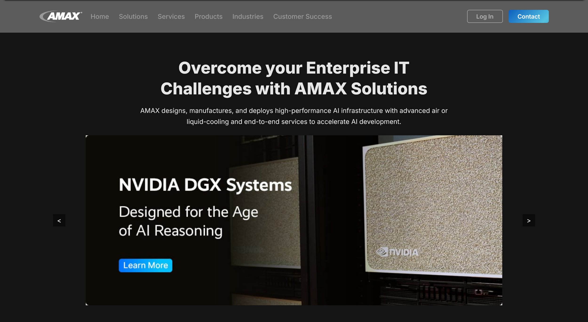
The website’s design had shifted twice in six months. After AMAX returned to WordPress, I helped create a fresh look with an updated interface.
Hero
The old homepage has two competing headlines, and the largest element promotes NVIDIA’s product instead of AMAX’s own value. The carousel arrows are small and easy to miss, and the navigation has low contrast and overlapping categories like Solutions, Services, and Products. The page offers no visible proof points or clear calls to action, so visitors can’t quickly see why AMAX is credible or what to do next.
Body Section
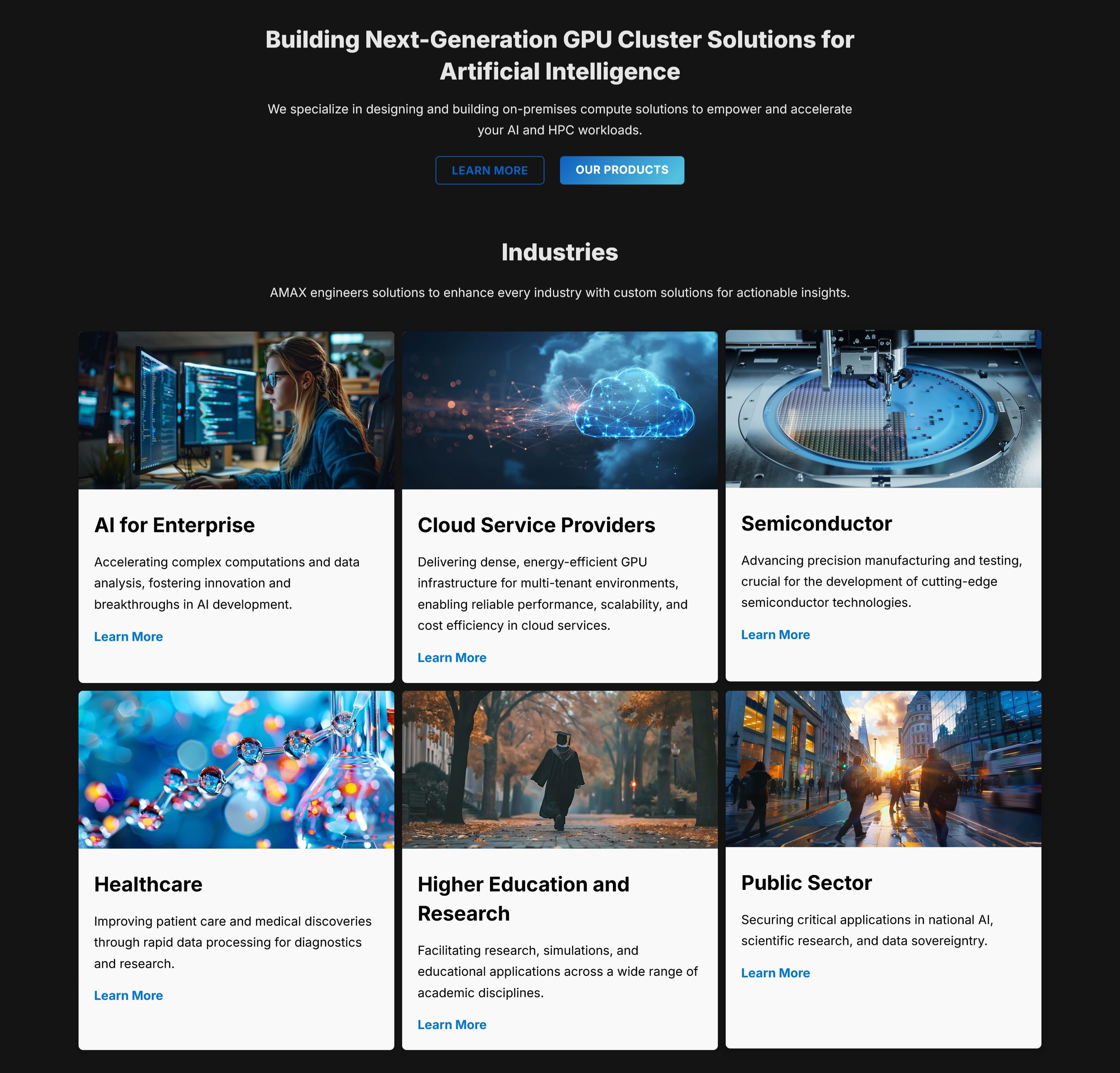
This section’s imagery is generic and sometimes unrelated to its labels, and the cards are misaligned, with “Learn More” links at uneven heights. The copy is abstract and jargon-heavy, with vague claims about serving “every industry” and no metrics or proof. The buttons and links are weak, with a low-contrast outline button and six identical “Learn More” links that don’t say where they lead.
Body Section cont.
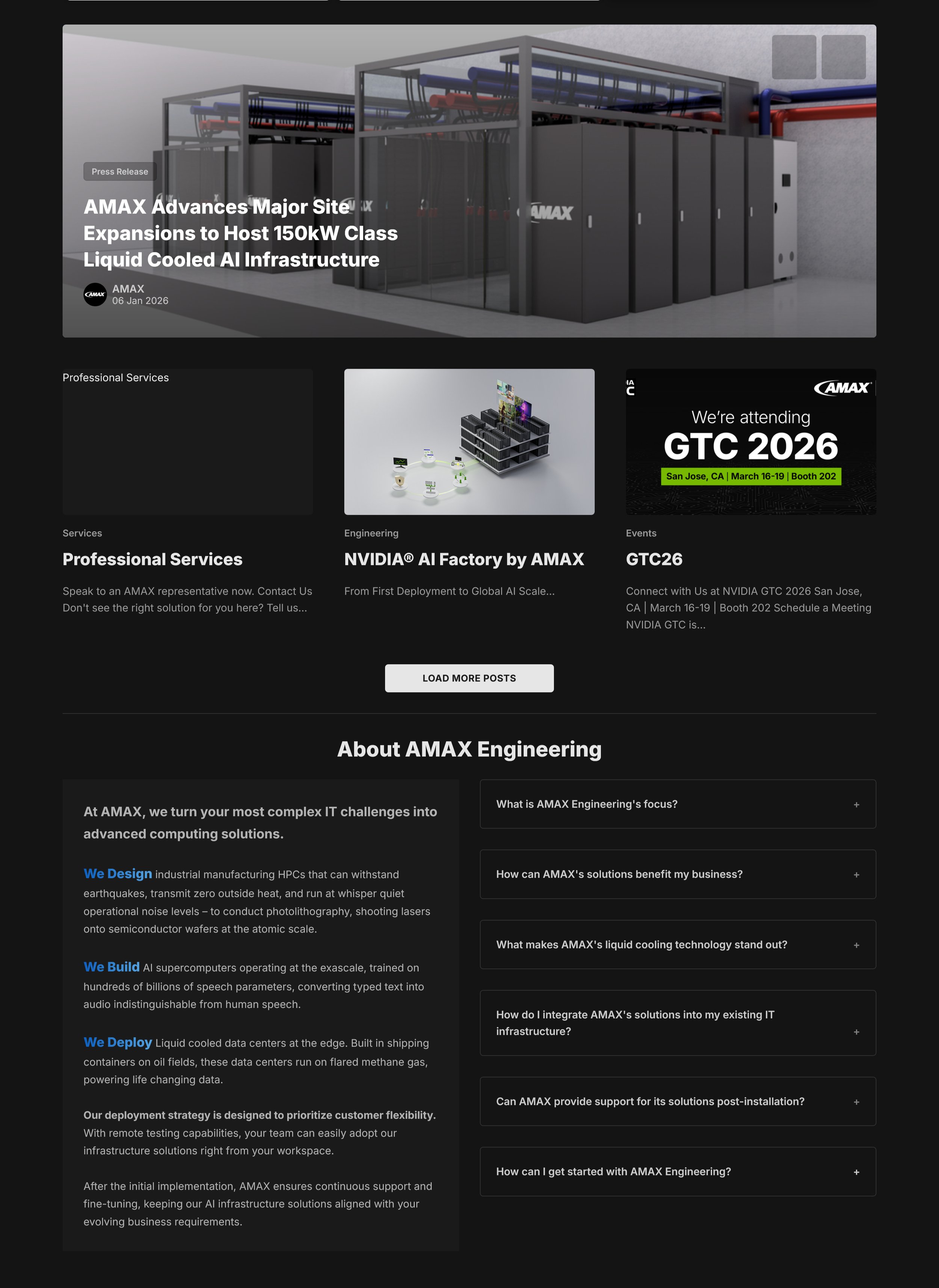
The company story (“About AMAX Engineering”) sits at the bottom, after a feed of news. The lack of visuals showing their history as a company with almost 50 years of experience isn’t clear. Visitors who want to know what AMAX does have to scroll past the announcements first. The cards mix a service page, an engineering article, and an event announcement with no section heading, so visitors can’t tell whether they’re looking at news, resources, or promoted pages.
Footer
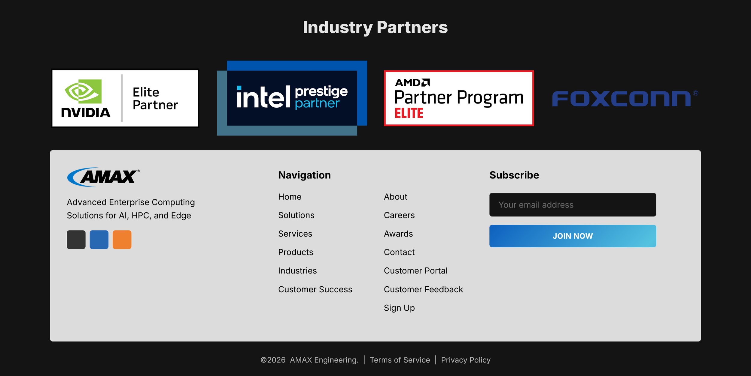
A new gray color is introduced in the footer. The textbox to subscribe to their newsletter recedes into the background rather than acts as a call to action. Ideally industry partners could be moved higher up in the home page hierarchy.
New Website Options
The color palette was pre-approved, so I focused on the UI elements and created a modern style in line with current design trends.
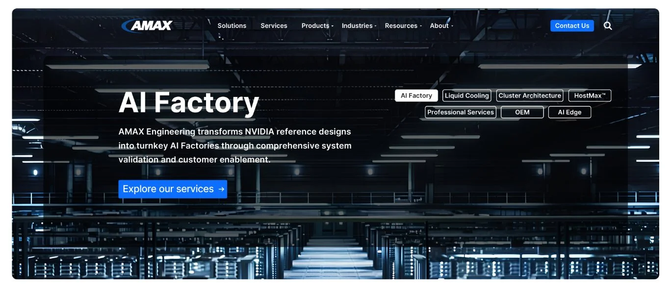
Option 1 Hero
The redesigned hero succeeds by replacing the old page’s competing headlines with one bold, focused message: “AI Factory.” Specific copy speaks directly to technical buyers, and an authentic data center background reinforces AMAX’s real-world expertise while keeping the dark, blue-accented brand look. A single bright call to action and a cleaner navigation bar make the next step obvious, and the topic tags give visitors a quick overview of the portfolio.
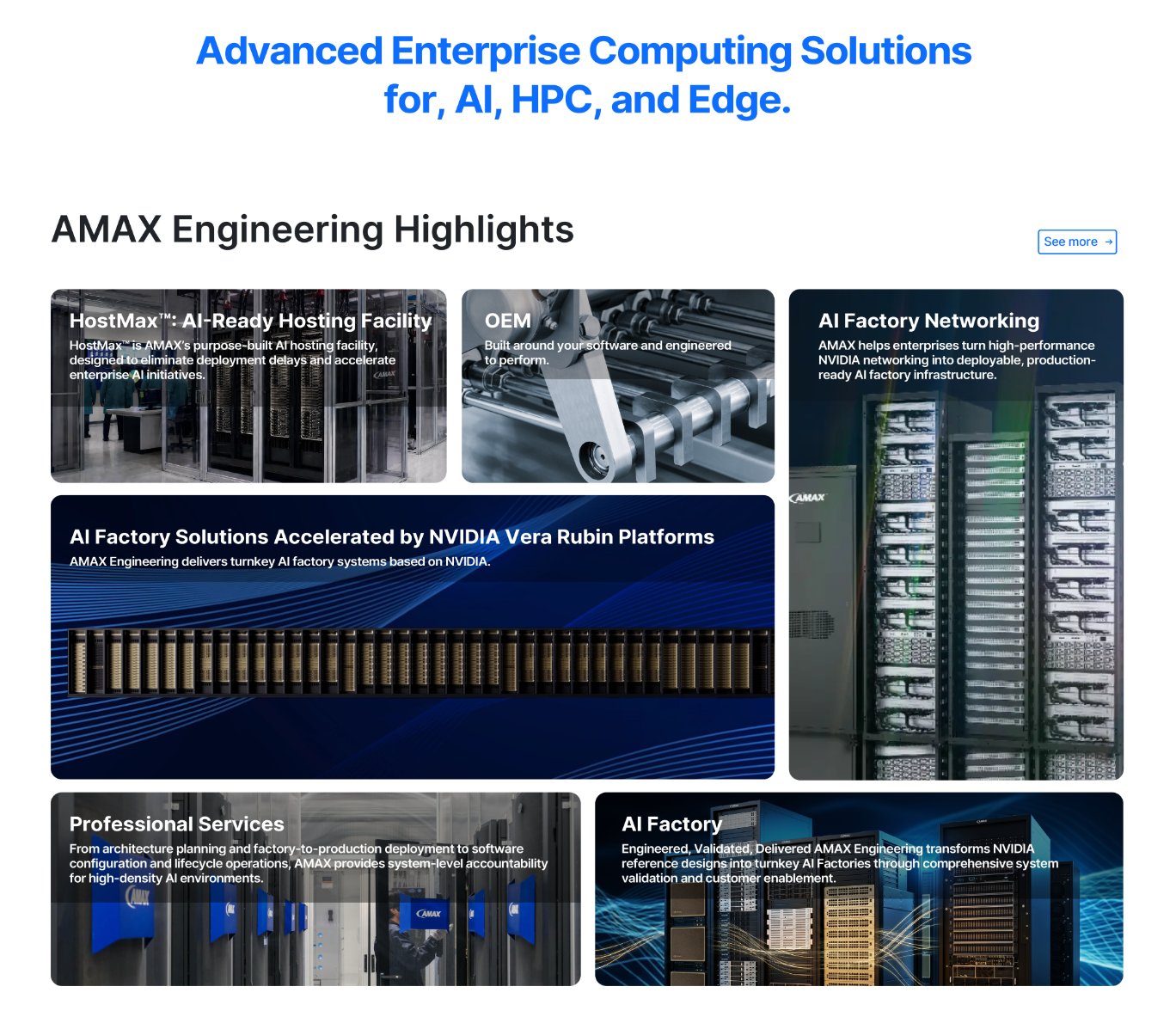
Option 1 Body
This section replaces the old site’s generic stock photos and uniform cards with a bento-style grid built from real AMAX imagery. The tile sizes signal priority, the copy is short and specific, and the images match their labels, so visitors can quickly see the breadth of AMAX’s portfolio. The blue headline and the consistent dark, blue-accented styling tie the section to the hero and the approved palette.
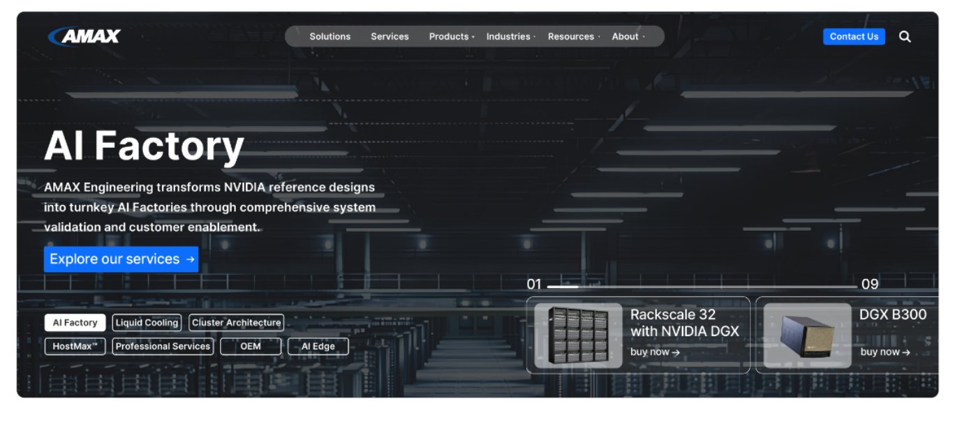
Option 2 Hero
This version of the hero builds on the same focused “AI Factory” message with a more refined layout. A floating navigation bar and a consistent left alignment make the page feel organized and modern, while the darker background keeps the text readable. Adding product cards with a visible progress counter turns the hero into a clear path to real AMAX systems, and the cards’ “buy now” links serve ready buyers without competing with the main call to action.
Option 2 Body
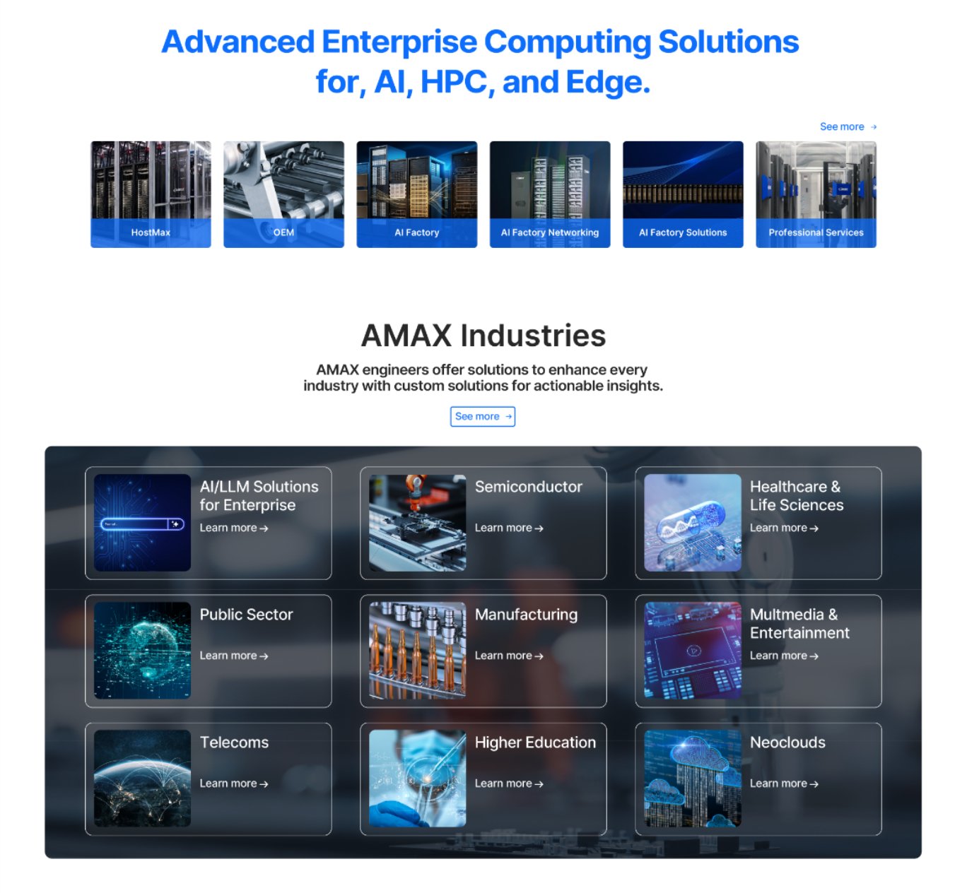
This version of the section gives visitors a compact, easy-to-browse overview of AMAX’s offering. A single row of labeled thumbnails covers products and services, and a dark frosted-glass panel presents nine industries in a uniform grid with aligned links. Compared with the bento layout, it trades visual drama for clarity and speed, which makes it a useful second option to show in your portfolio.
Option 1 Body and Footer
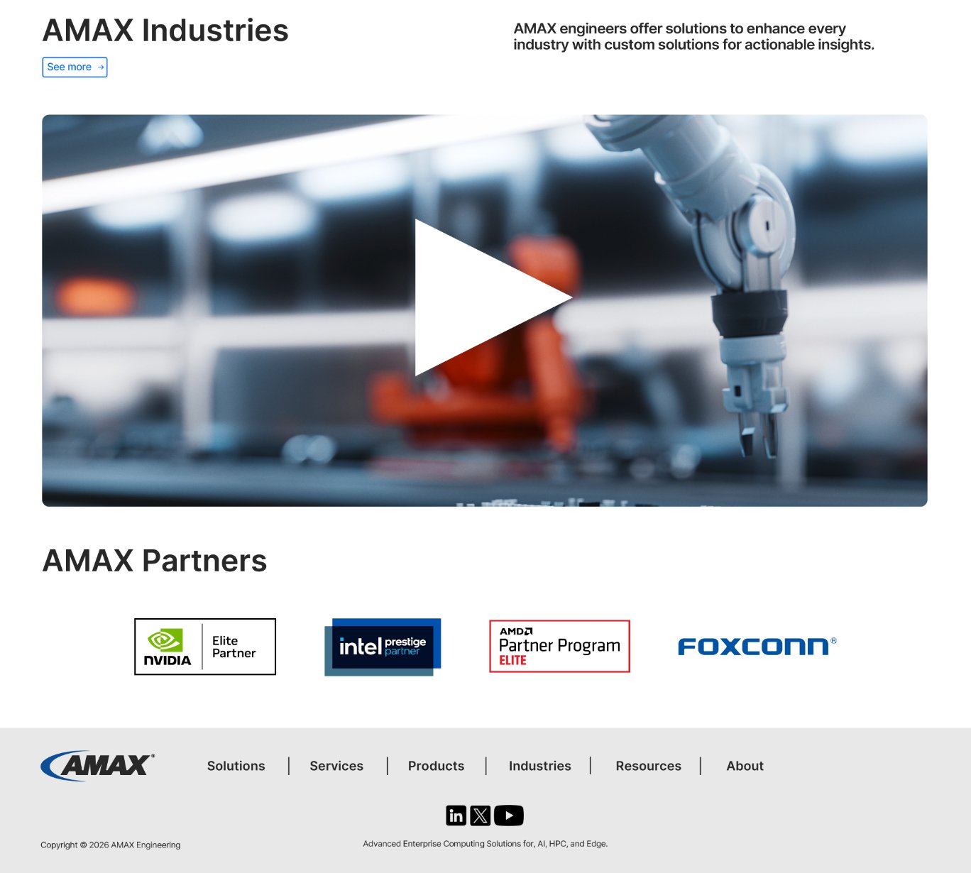
This option focuses on atmosphere and simplicity. A large video block with a clear play button adds visual drama and invites engagement, and a clean row of partner logos builds credibility without clutter. The light footer is minimal and well organized, with navigation, social links, and the company tagline in a calm layout. It works well as a polished, visual closing section that keeps the page feeling open and modern.
Option 2 Body and Footer
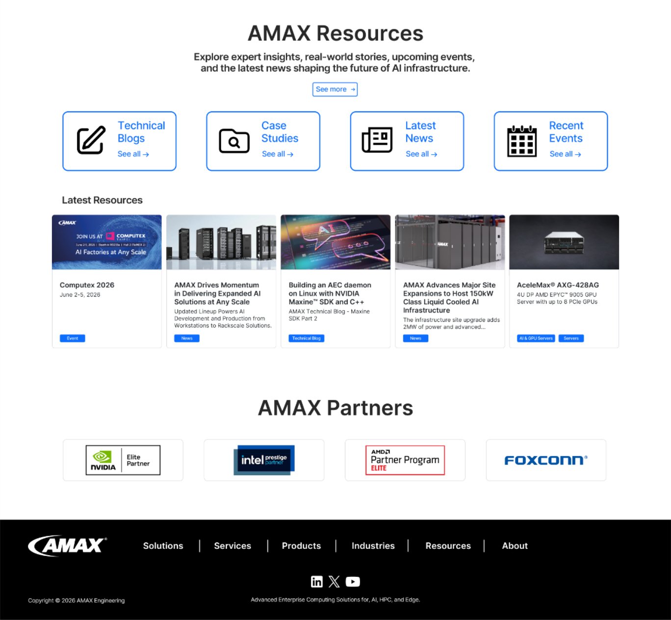
This option focuses on usefulness and depth. Four clearly labeled category cards organize the content, and a row of image-led resource cards with color-coded tags shows that AMAX has real news, events, technical articles, and products to explore. The partner logos are neatly framed in cards that match the rest of the section, and the blue accents keep the interface cohesive. The dark footer anchors the page and ties back to the hero, which makes this a strong choice for showing credibility and a steady flow of content.