Turnstile AI is a portfolio case study that got a little out of hand in the best way. What started as a concept turned into a fully realized SaaS brand with real positioning, real marketing materials, and a product designed to feel like it already exists in the market. The goal was never just to look good. It was to feel real.
Product Overview
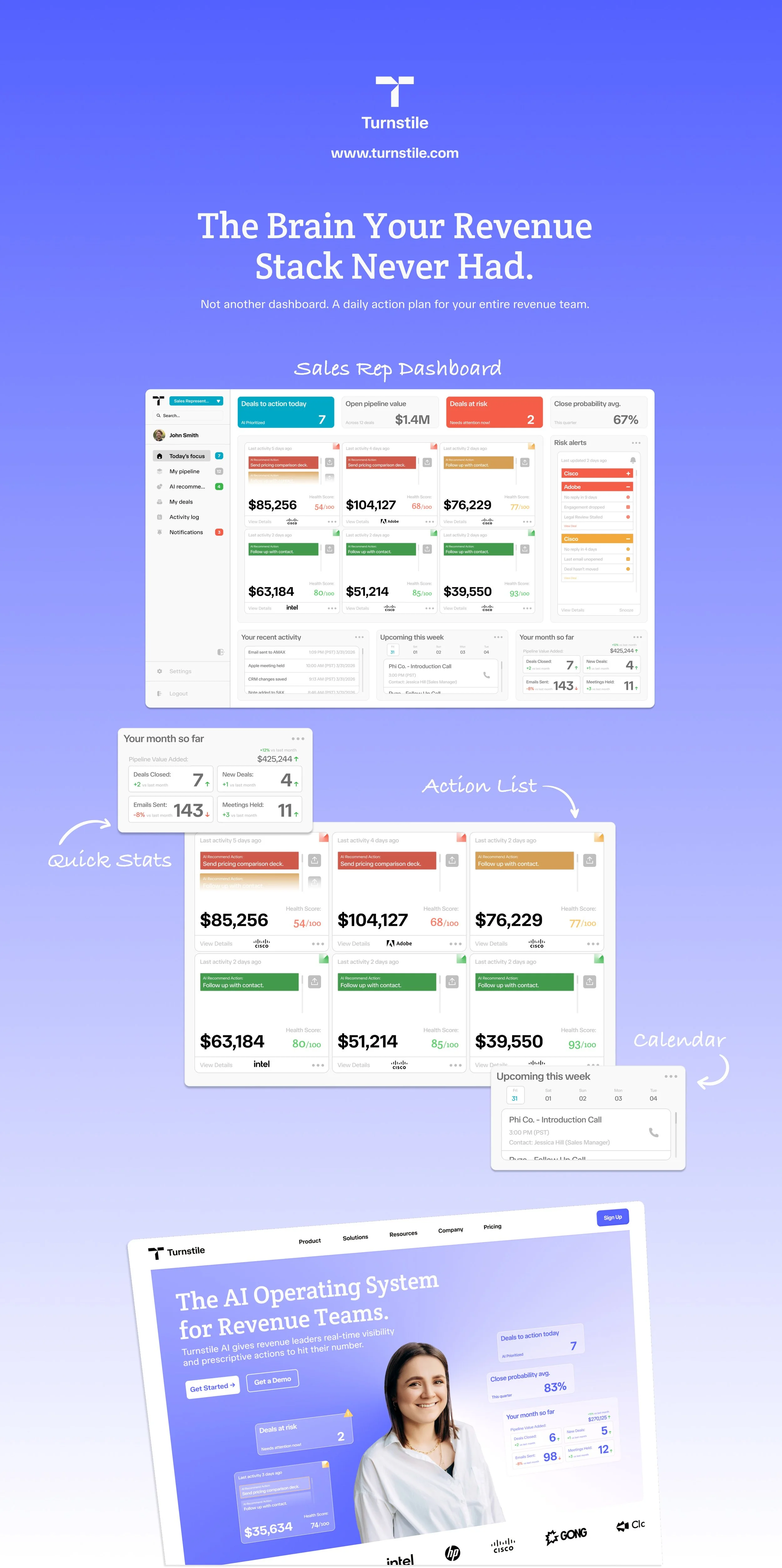
Revenue teams receive a lot of different signals from various tools. Having a single tool sit across the entire revenue stack; along with, having it suggest the next best action to take to move revenue forward, can provide clarity for any team. Helping leaders forecast with confidence and managers coach reps who are capable of starting every day knowing exactly which deals to prioritize what to do for each one.
Branding Issues
Finding opportunities for SaaS companies to display their “brand.”
Incorporating the AI “feel” as well into a standard SaaS “look.”
Avoid looking too “tech-e”, audience are sales professionals.
Focus on demonstrating increased efficiency (decreasing their time wasted).
Branding Solutions
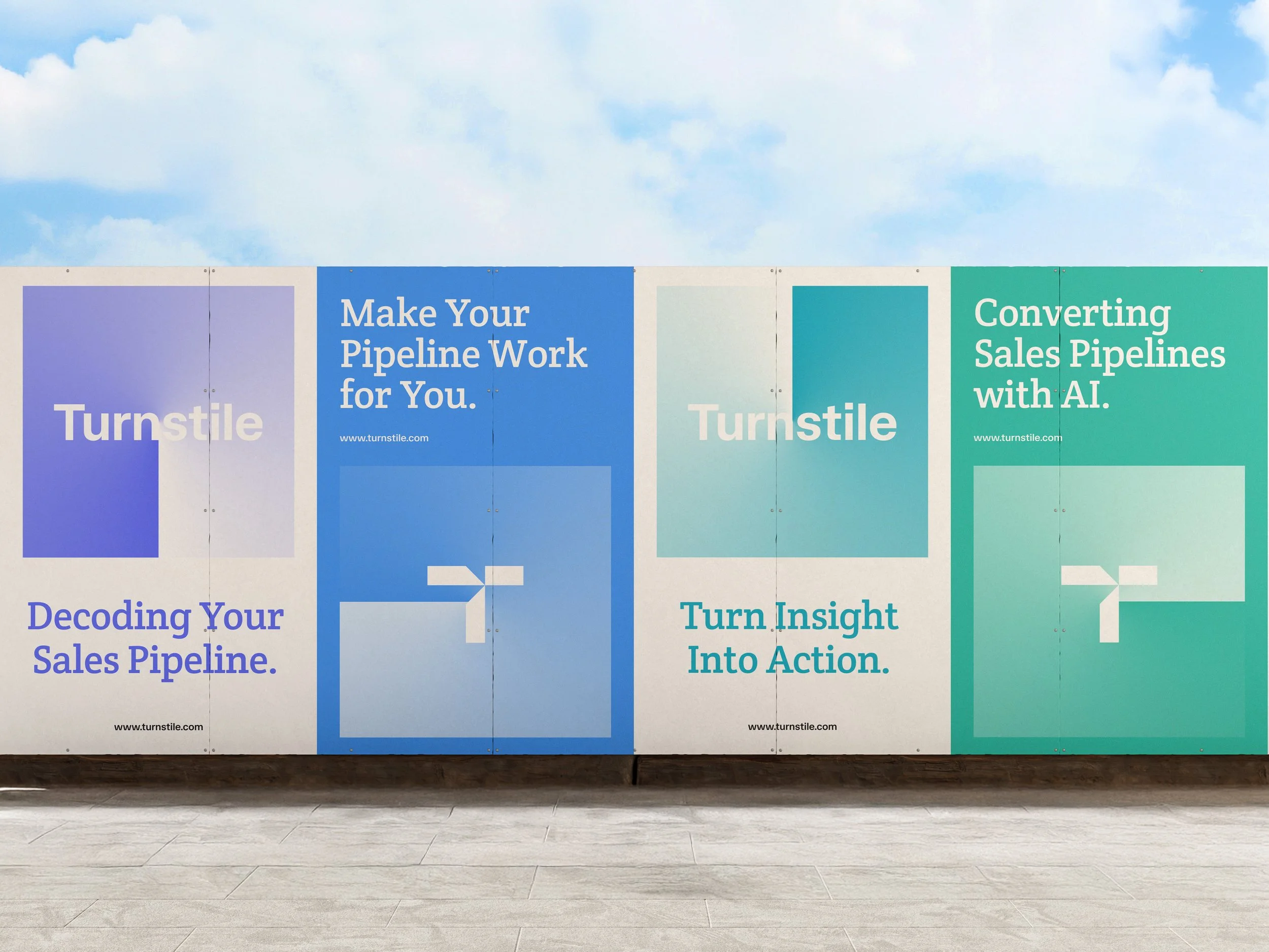
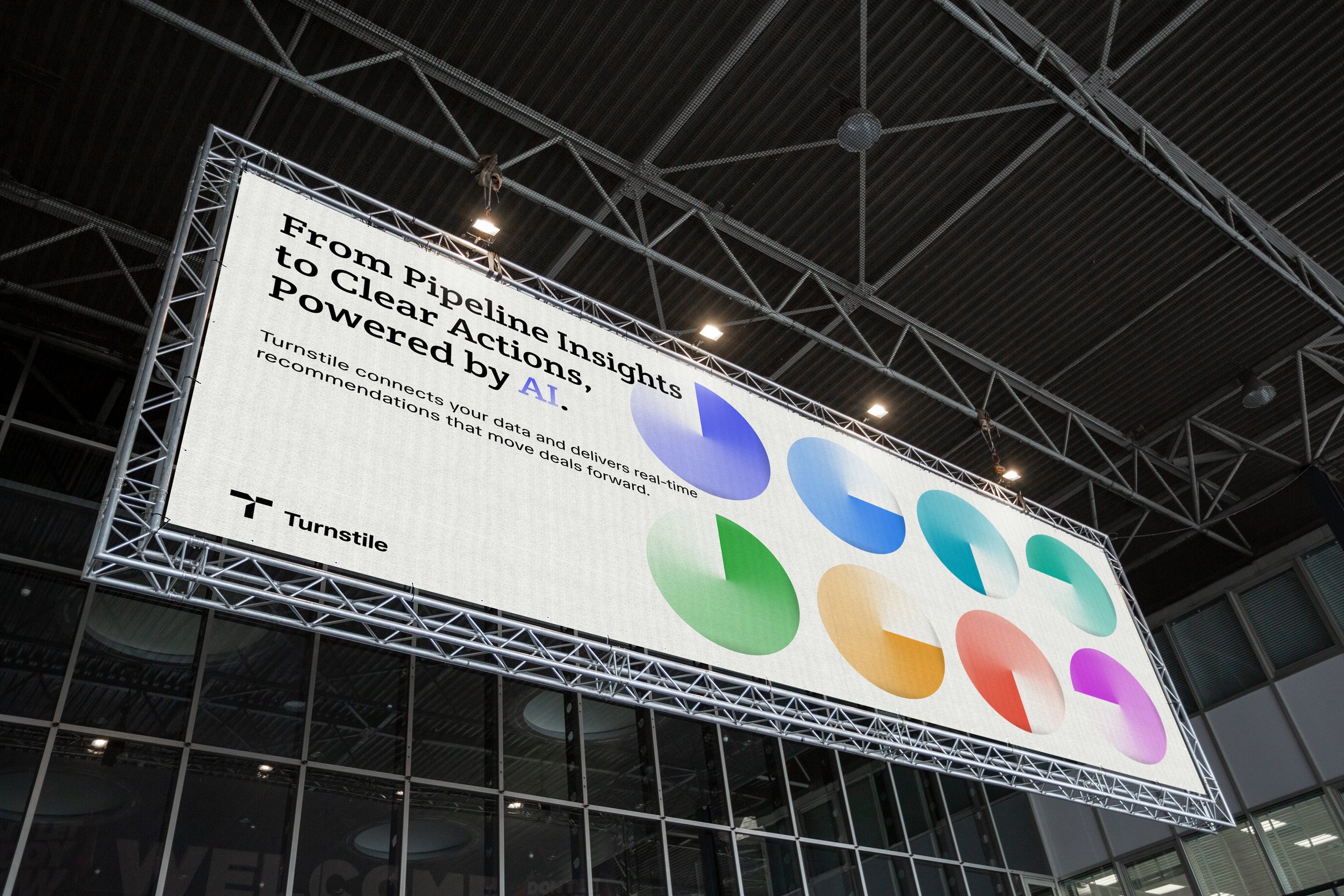
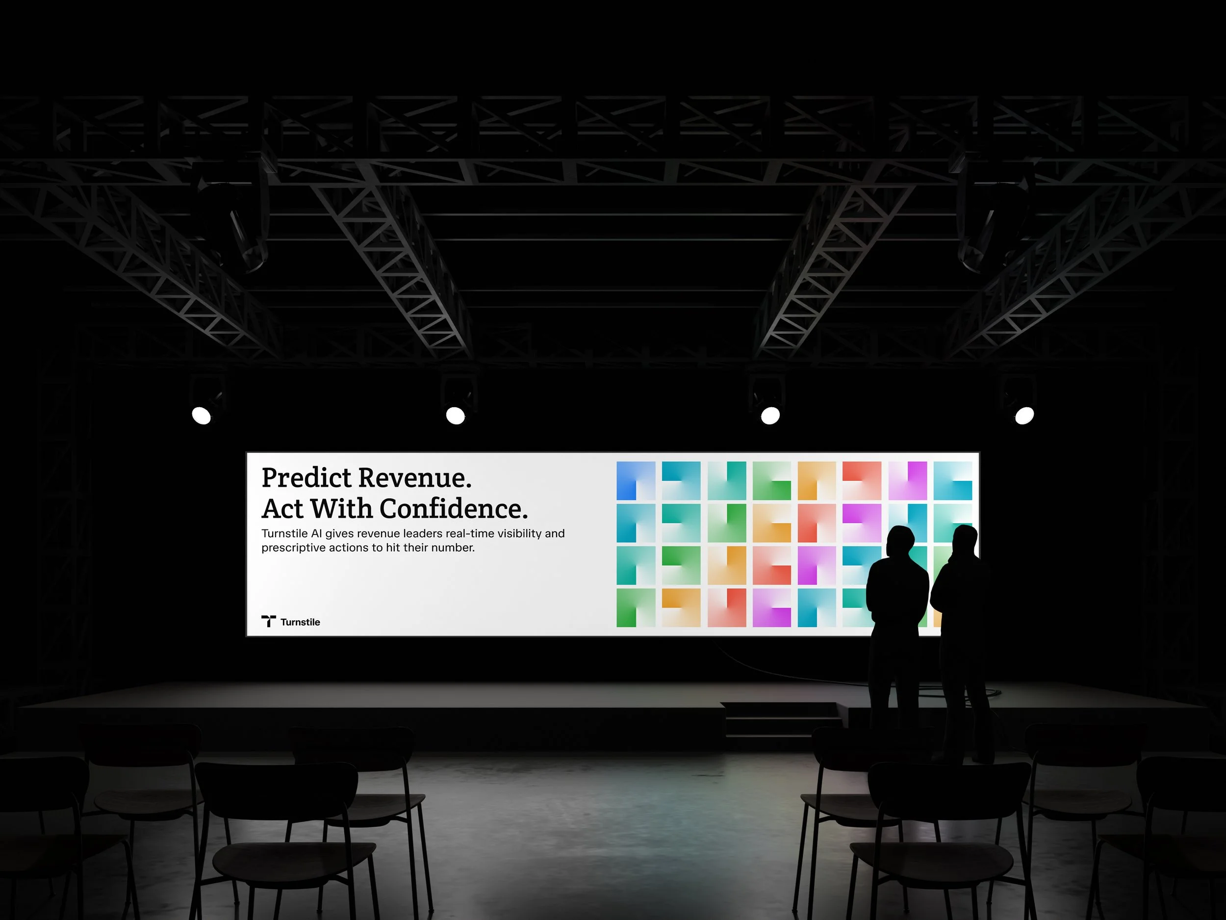
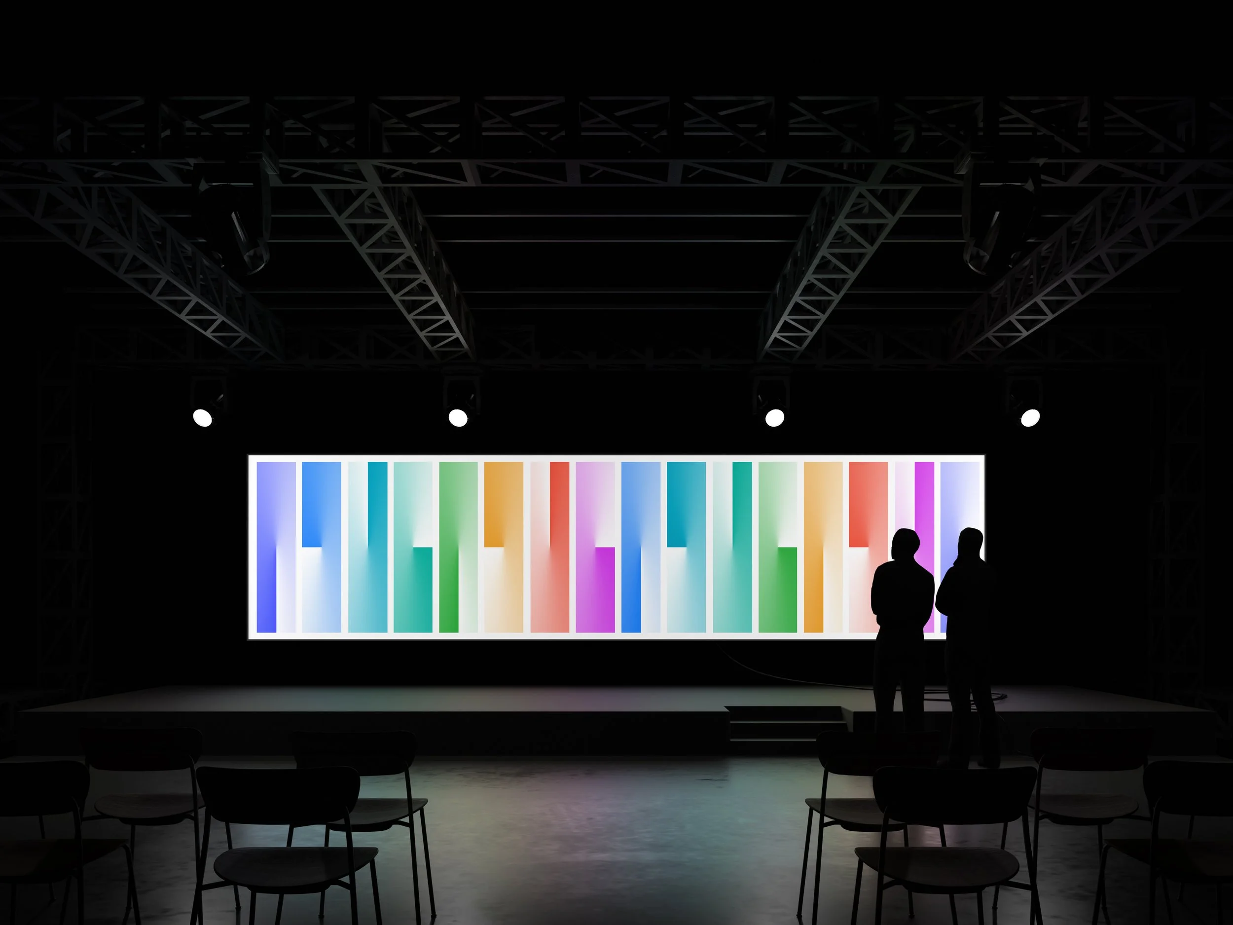
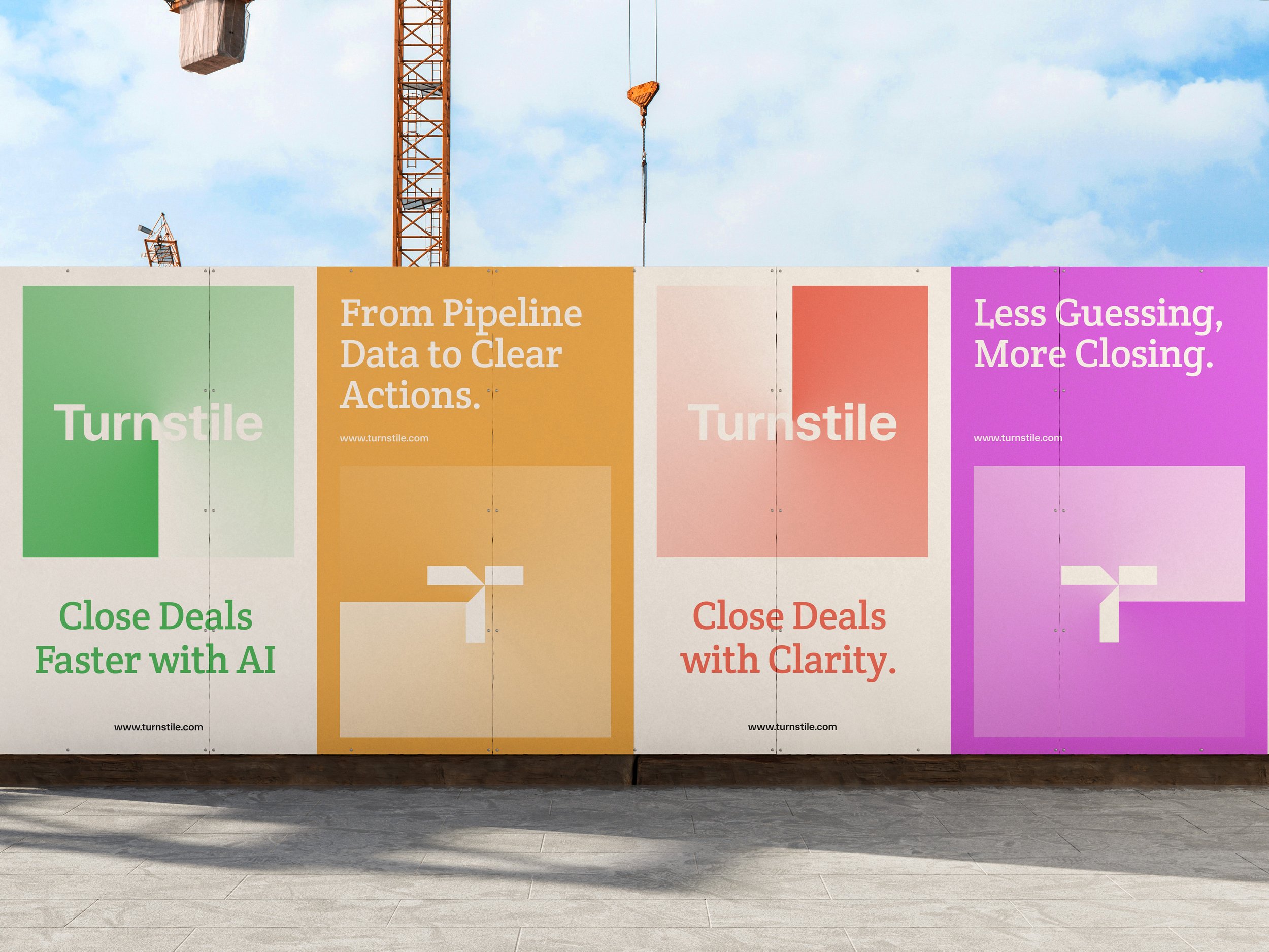
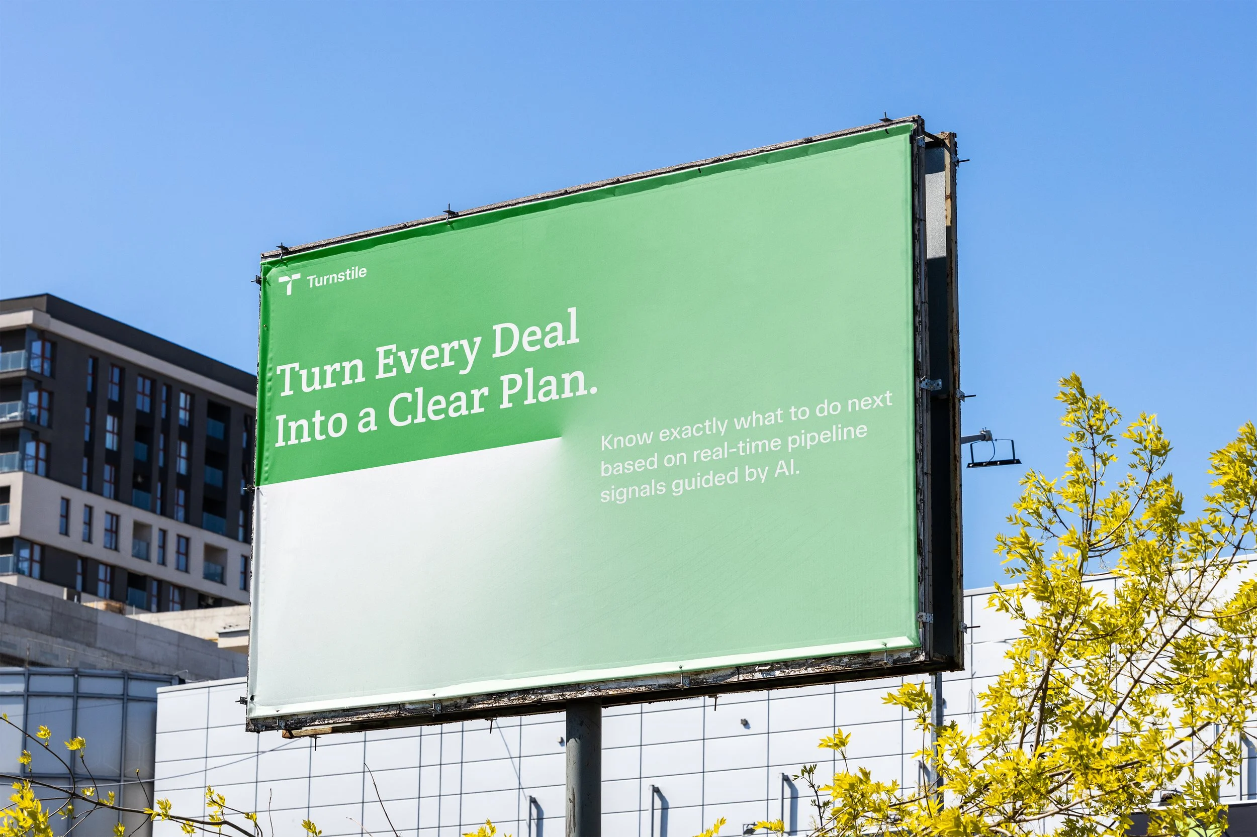
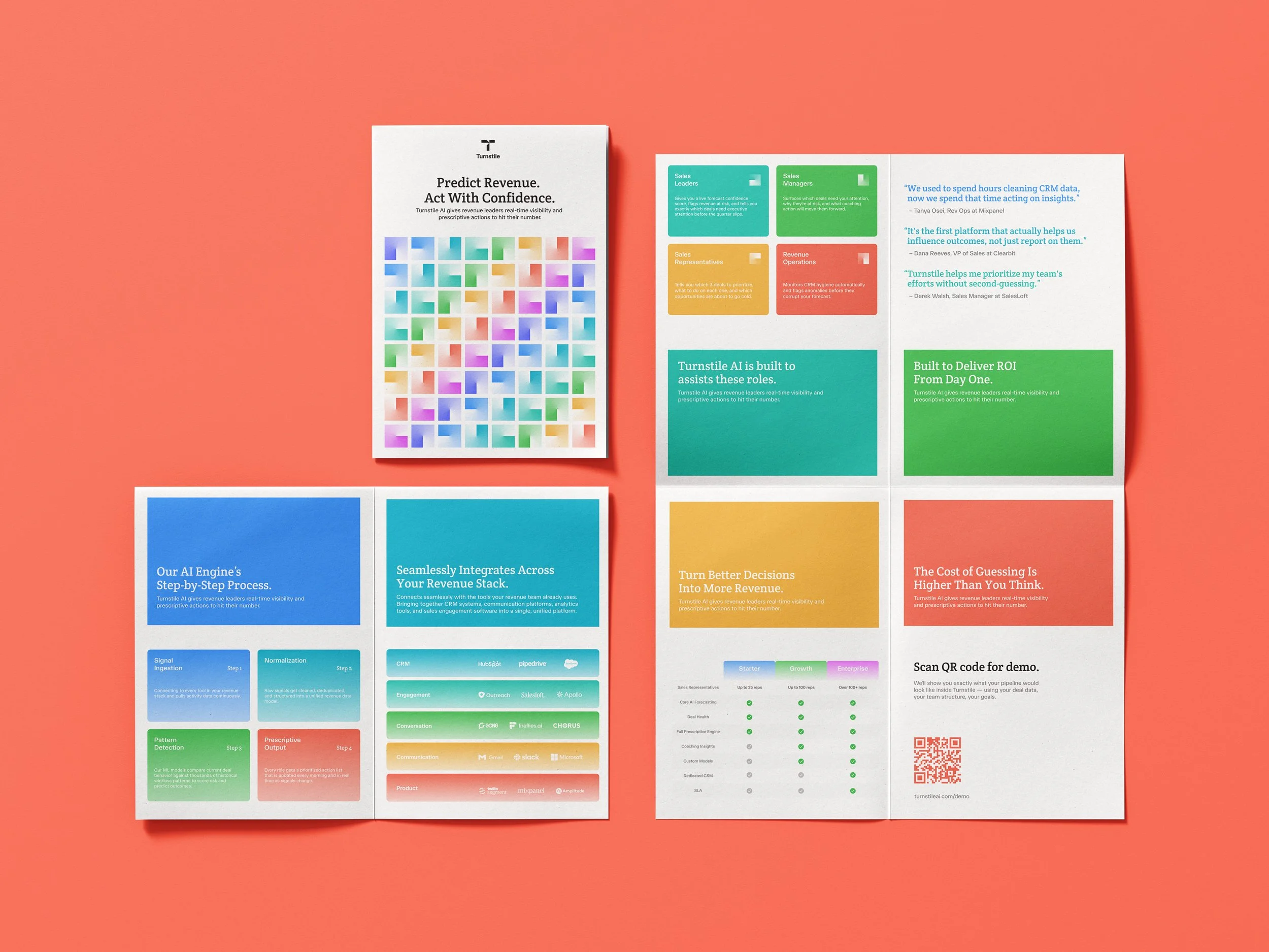
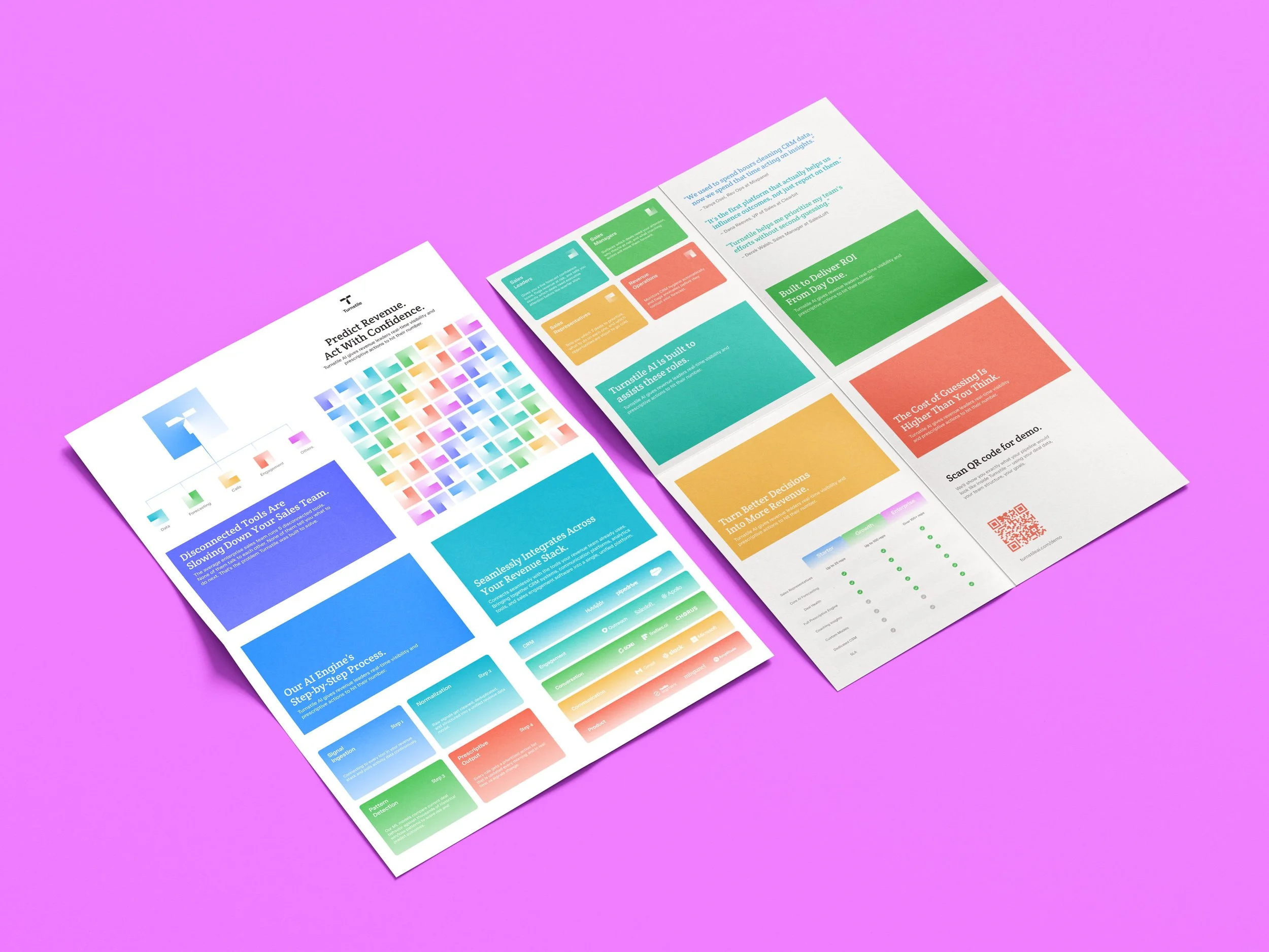
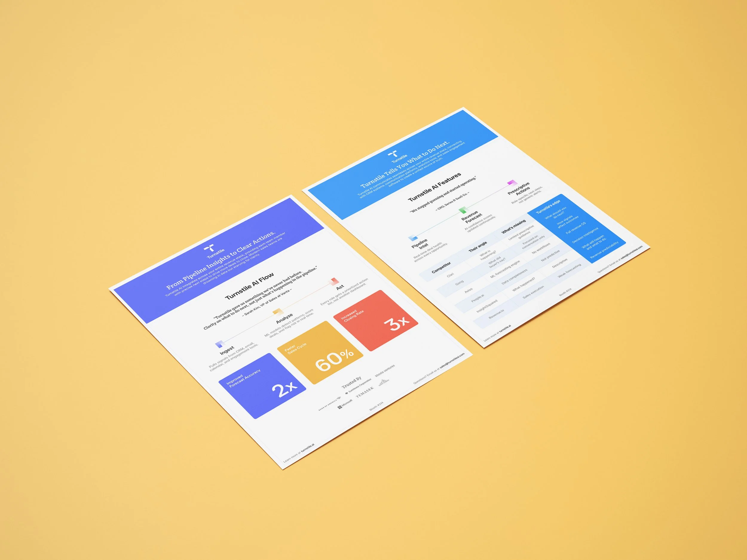
Tradeshows and events along with “take-home” material that usually involves print deliverables.
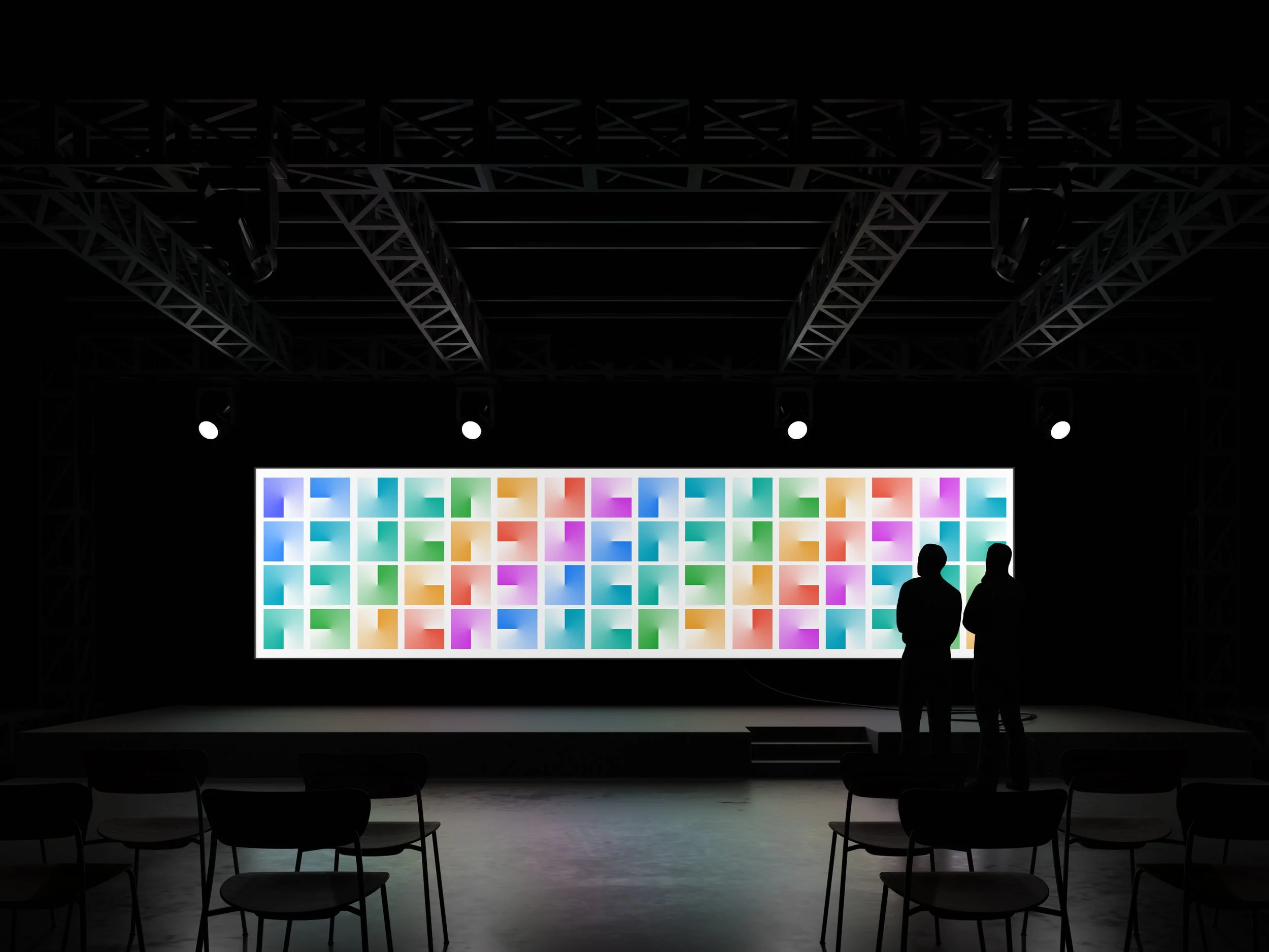
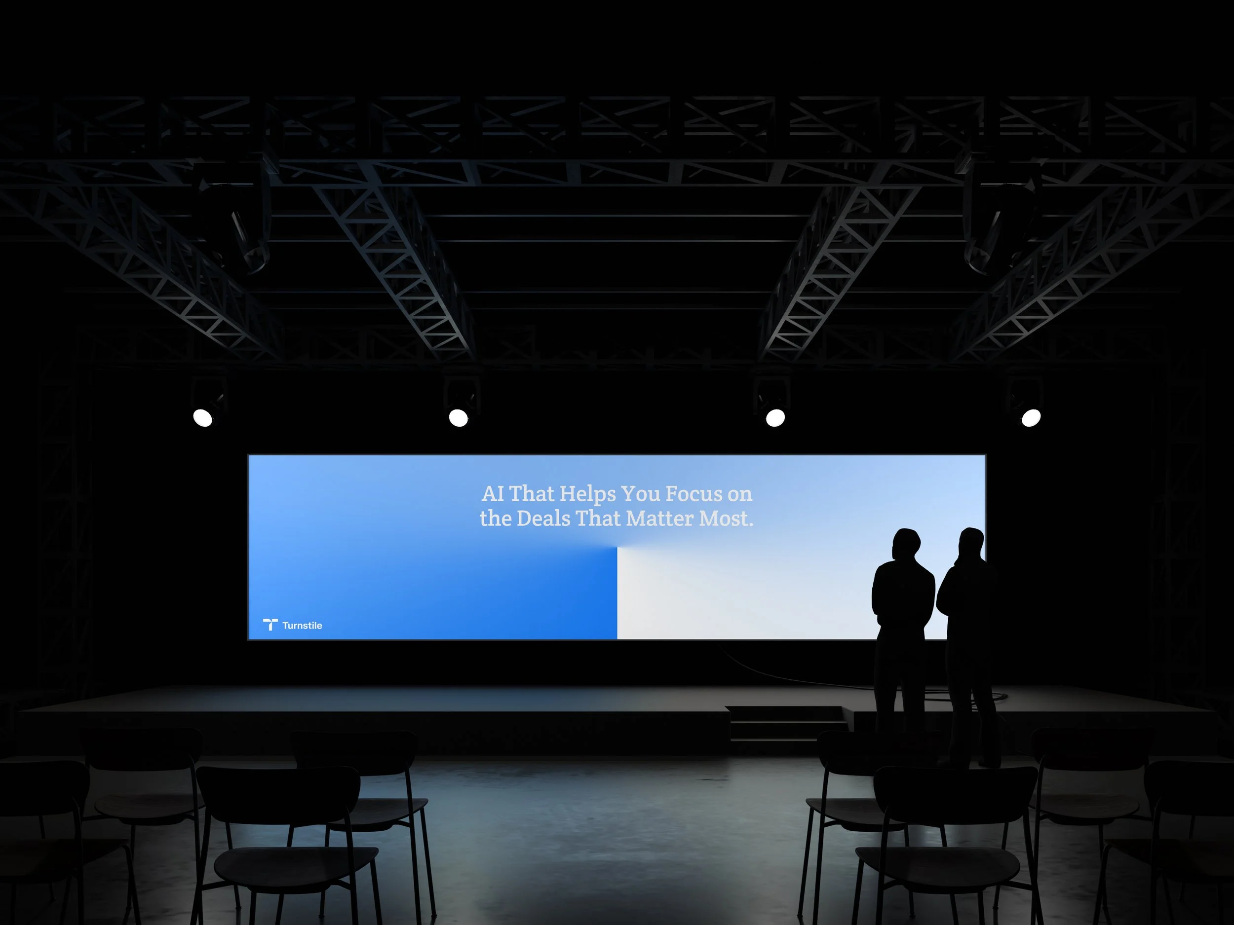
Playing with gradients and utilizing the negative space to incorporate a feeling of ethereal clarity.
Use graphics that combine real people and their dashboards.
Use the idea of “time” as a branding element to remind the audience of what their saving.
UI/UX Issues
Designing for four different mental models (Sales Leaders, Rep, Manager, RevOps).
Balancing data density with clarity.
Making AI recommendations feel trustworthy.
Designing for urgency without creating anxiety.
UI/UX Solutions
Build four completely separate dashboard experiences (work in progress…)
Anchoring each screen around 3 questions( are we hitting our number, which deals are at risk, and what to do about it).
Always show the signal behind the recommendation alongside the recommendation itself.
Establish clear indicators of the severity hierarchy across the product.
Design Inspiration
Goal was to find references where color, abstraction, and the human element are combined. When it came to the design system I wanted to find a good use of colors and dashboards utilizing different metrics such as stats, sales growth, calendars and other similar features that may be utilized by revenue focused teams.
Design Tools
Goal was to find references where color, abstraction, and the human element are combined. When it came to the design system I wanted to find a good use of colors and dashboards utilizing different metrics such as stats, sales growth, calendars and other similar features that may be utilized by revenue focused teams.
Pen and Paper

Illustrator
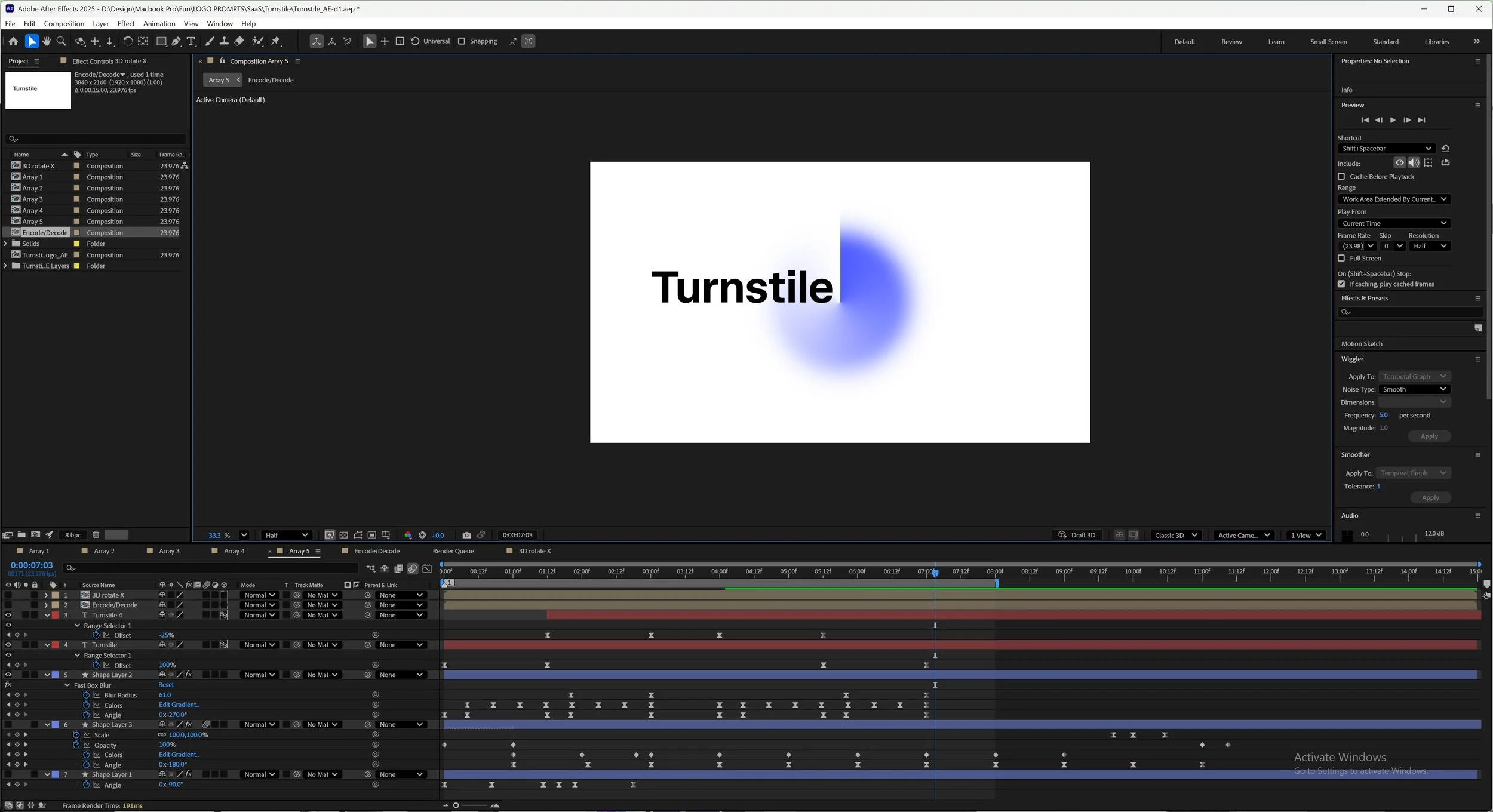
After Effects
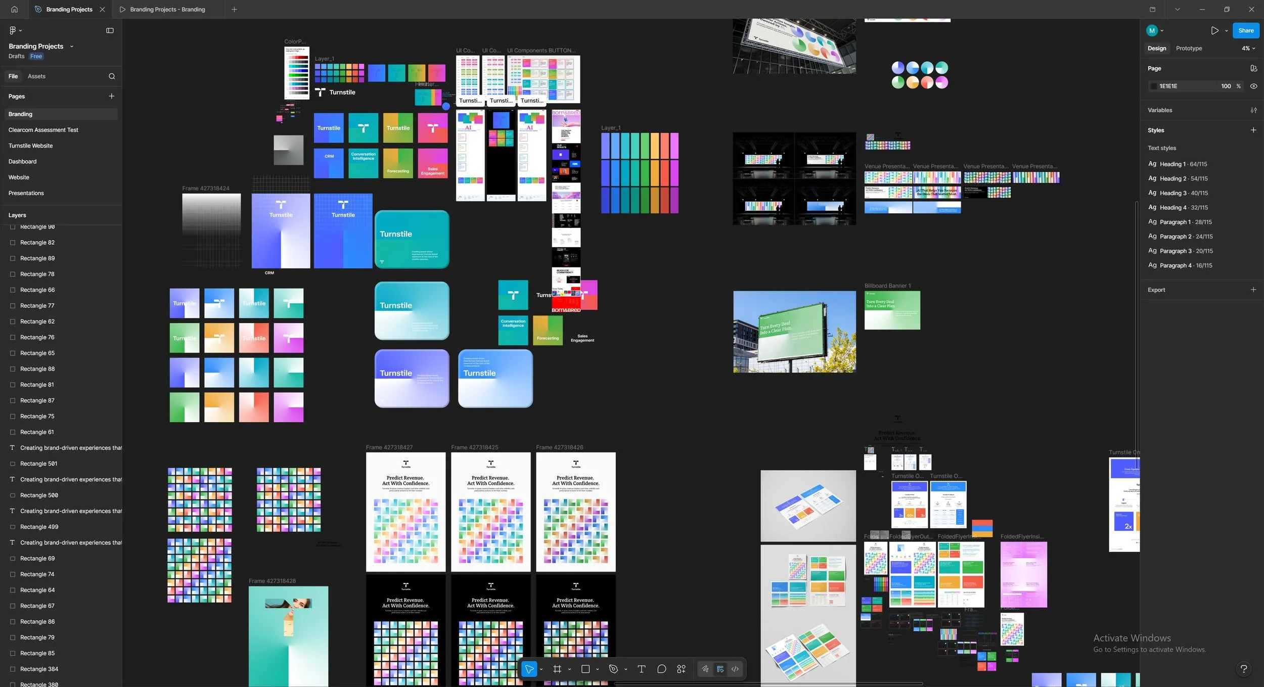
Figma
Visual Design
Goal was to find references where color, abstraction, and the human element are combined. When it came to the design system I wanted to find a good use of colors and dashboards utilizing different metrics such as stats, sales growth, calendars and other similar features that may be utilized by revenue focused teams.
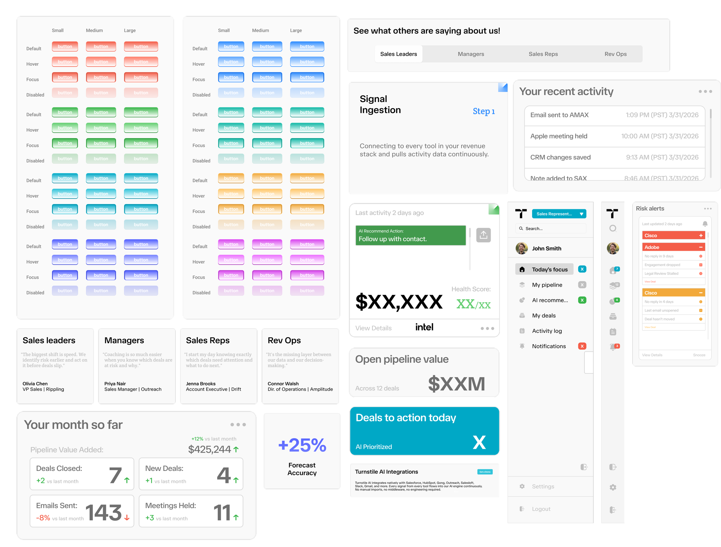
Colors
Purple
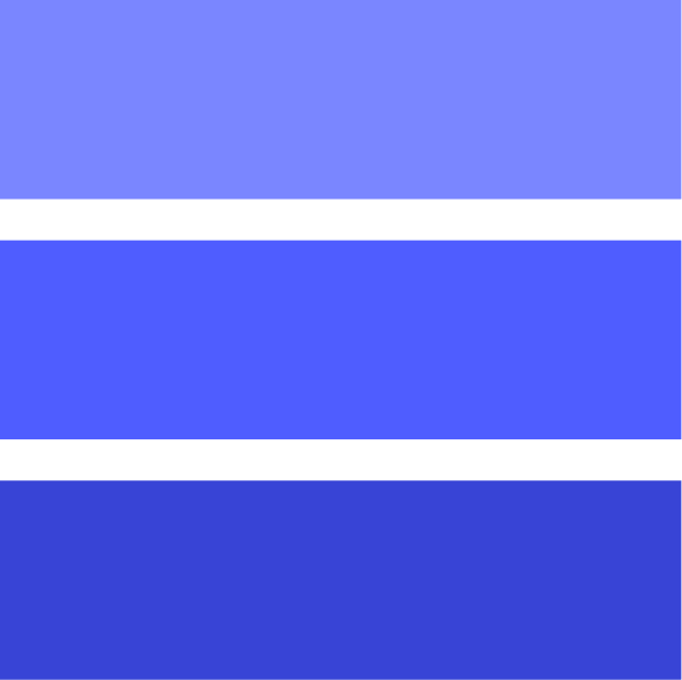
Green

Typography
TASA Orbiter
Crete Round

Components
Visuals
Angular Gradient

Sales People

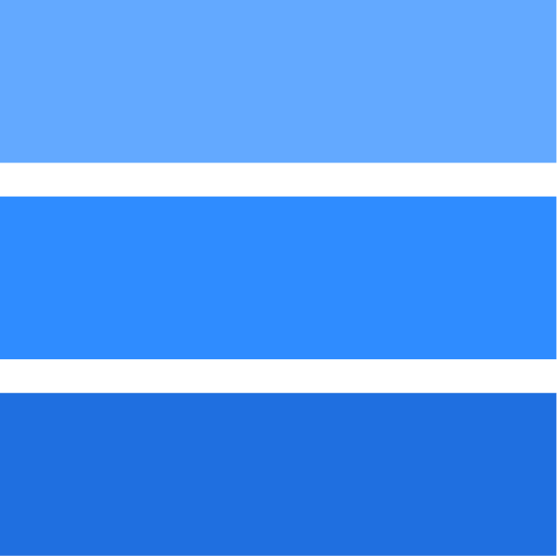
Cyan
Orange

Gradient

Turquoise

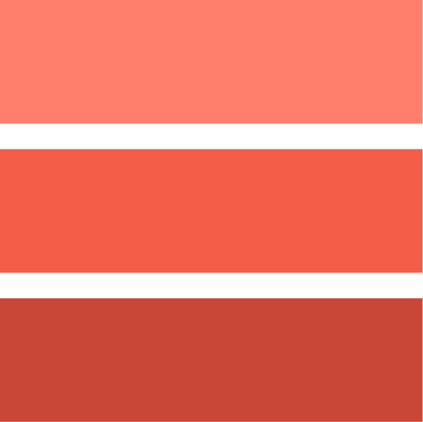
Red
Solid

Turn Dials
Aquamarine

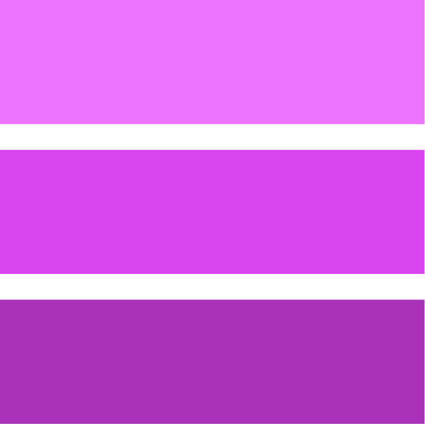
Pink
Mixed