BoltNest

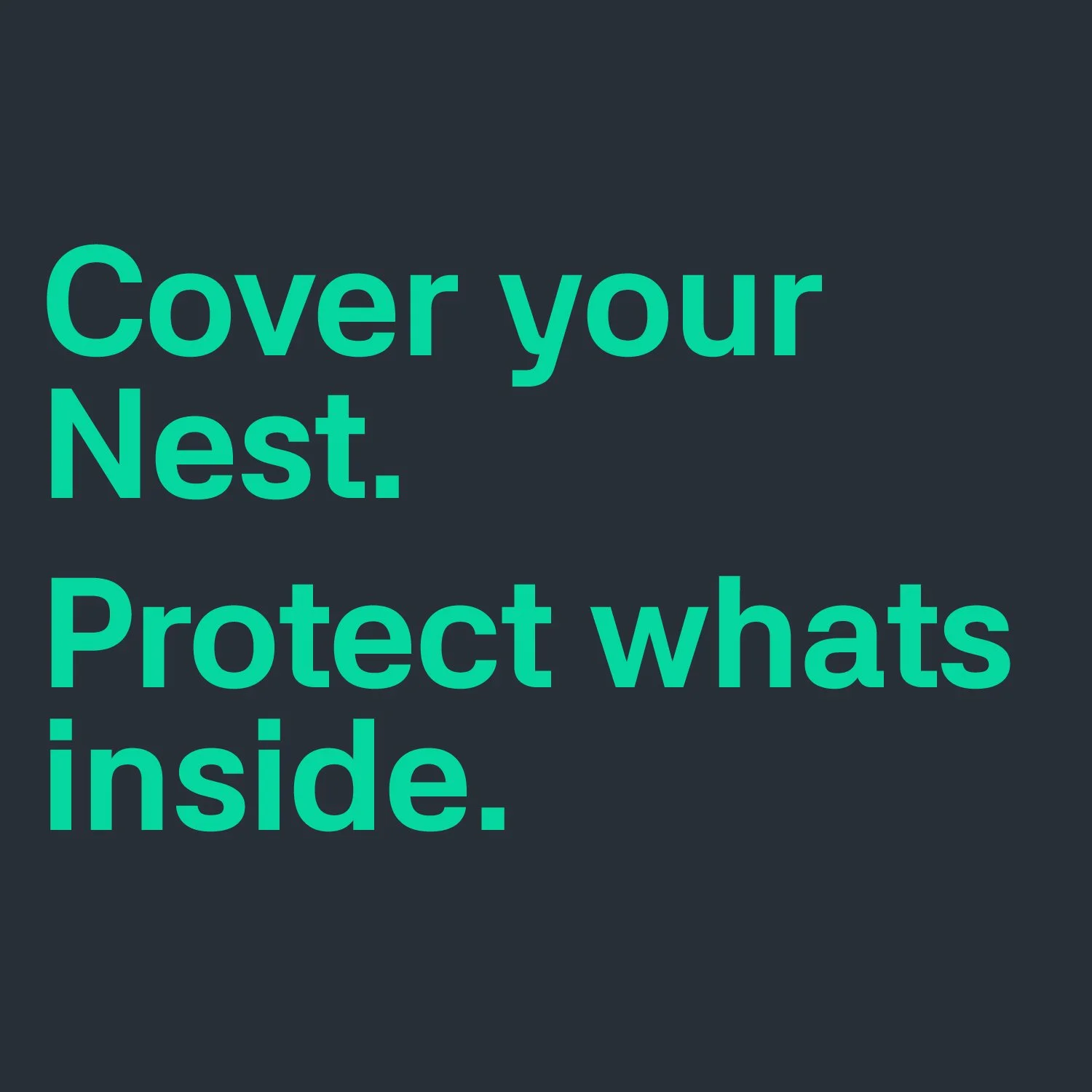
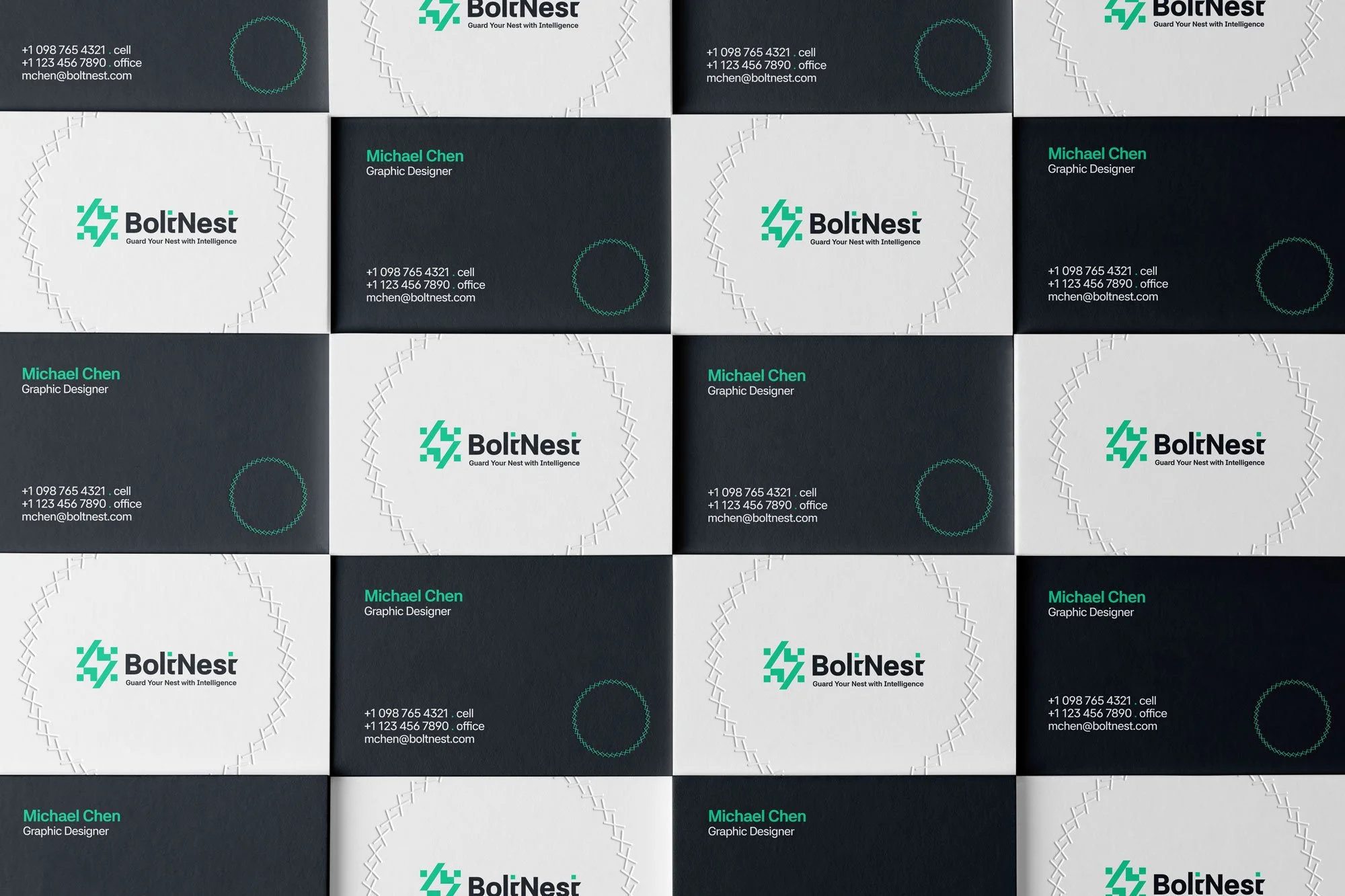
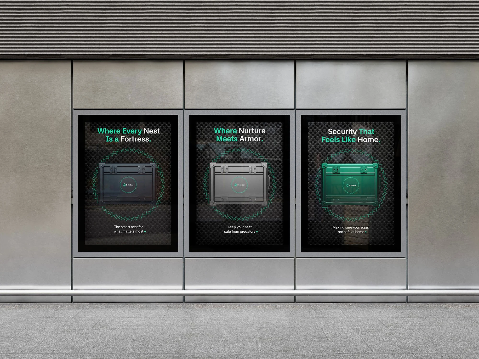
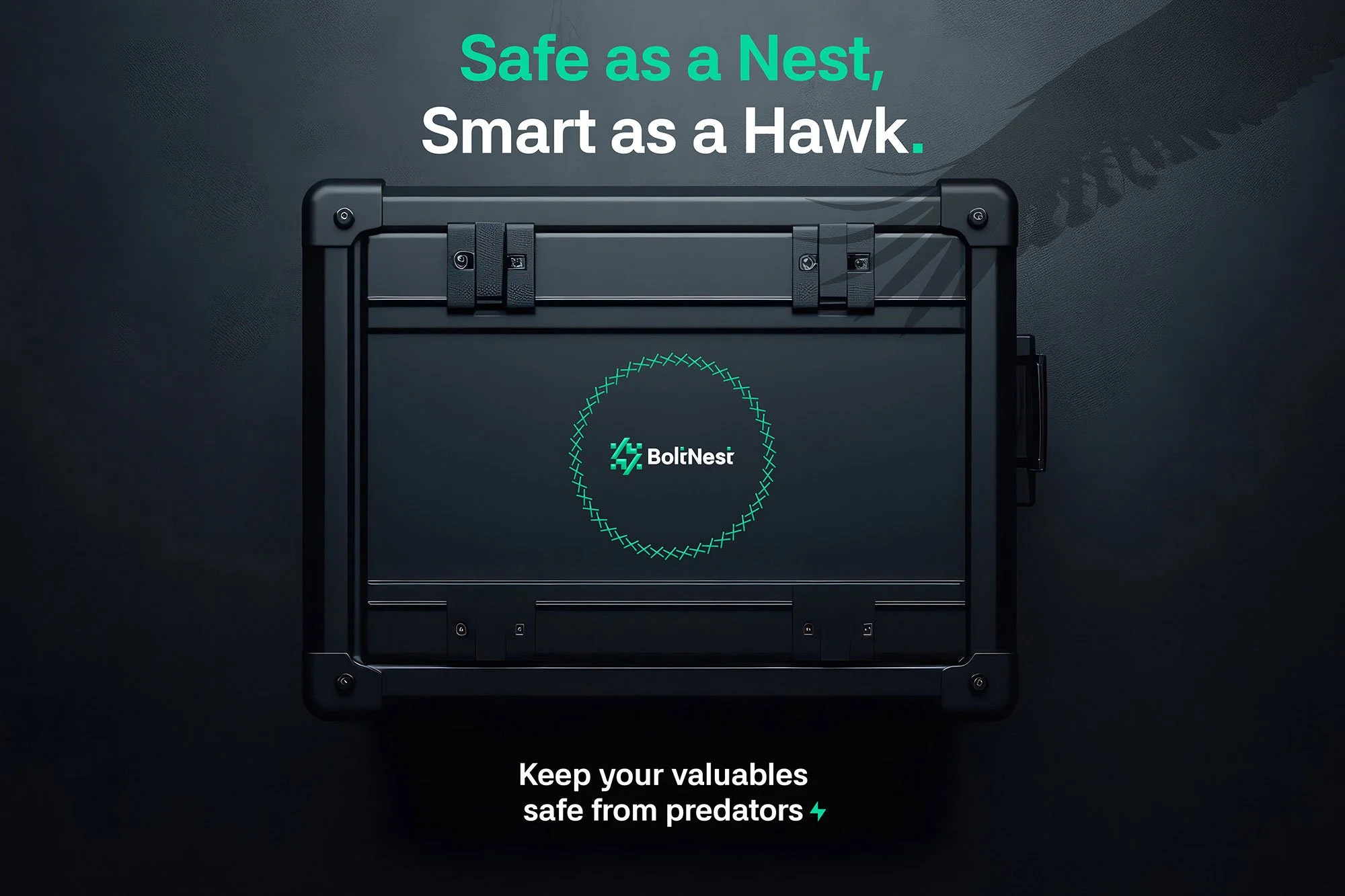
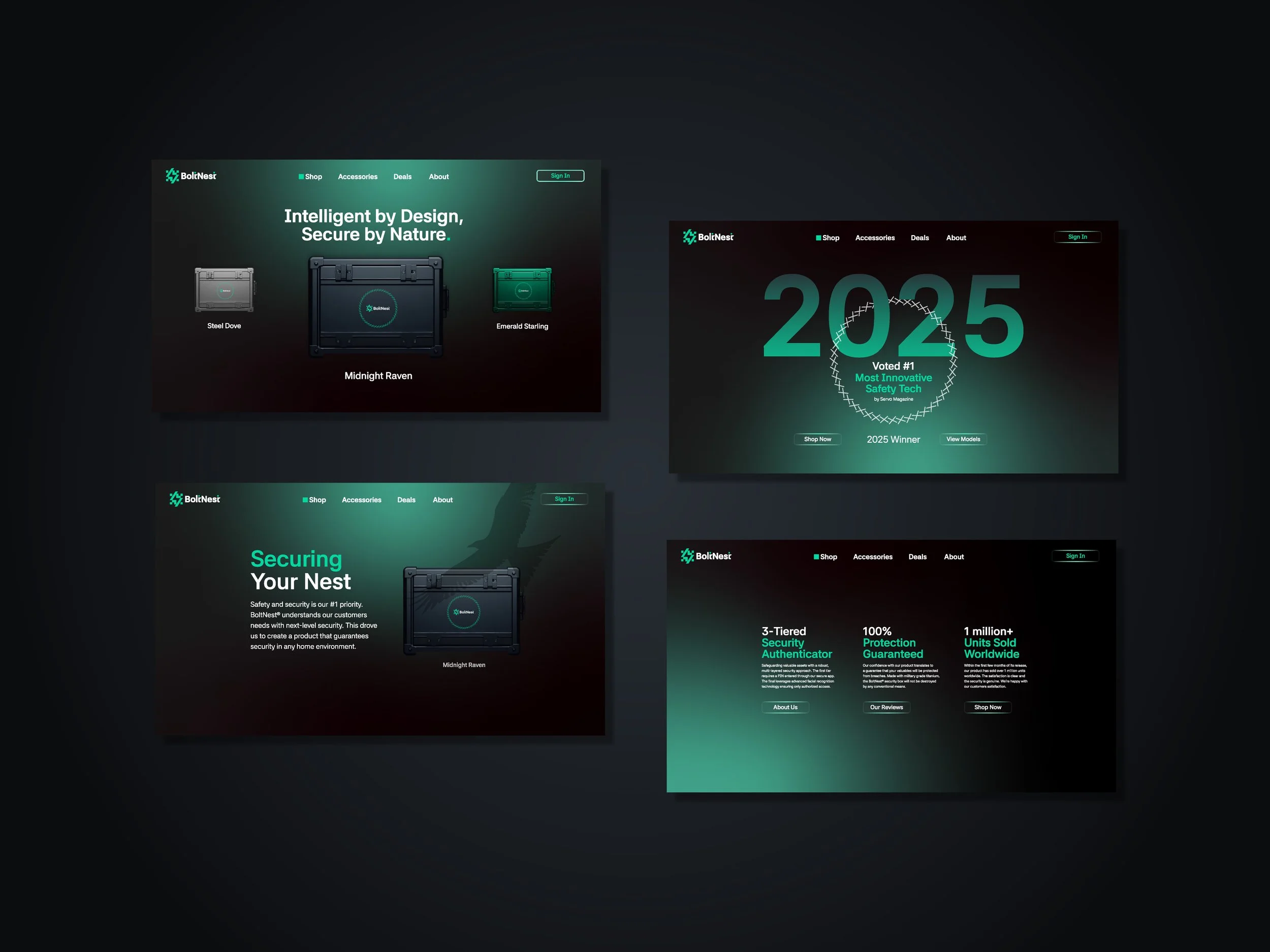
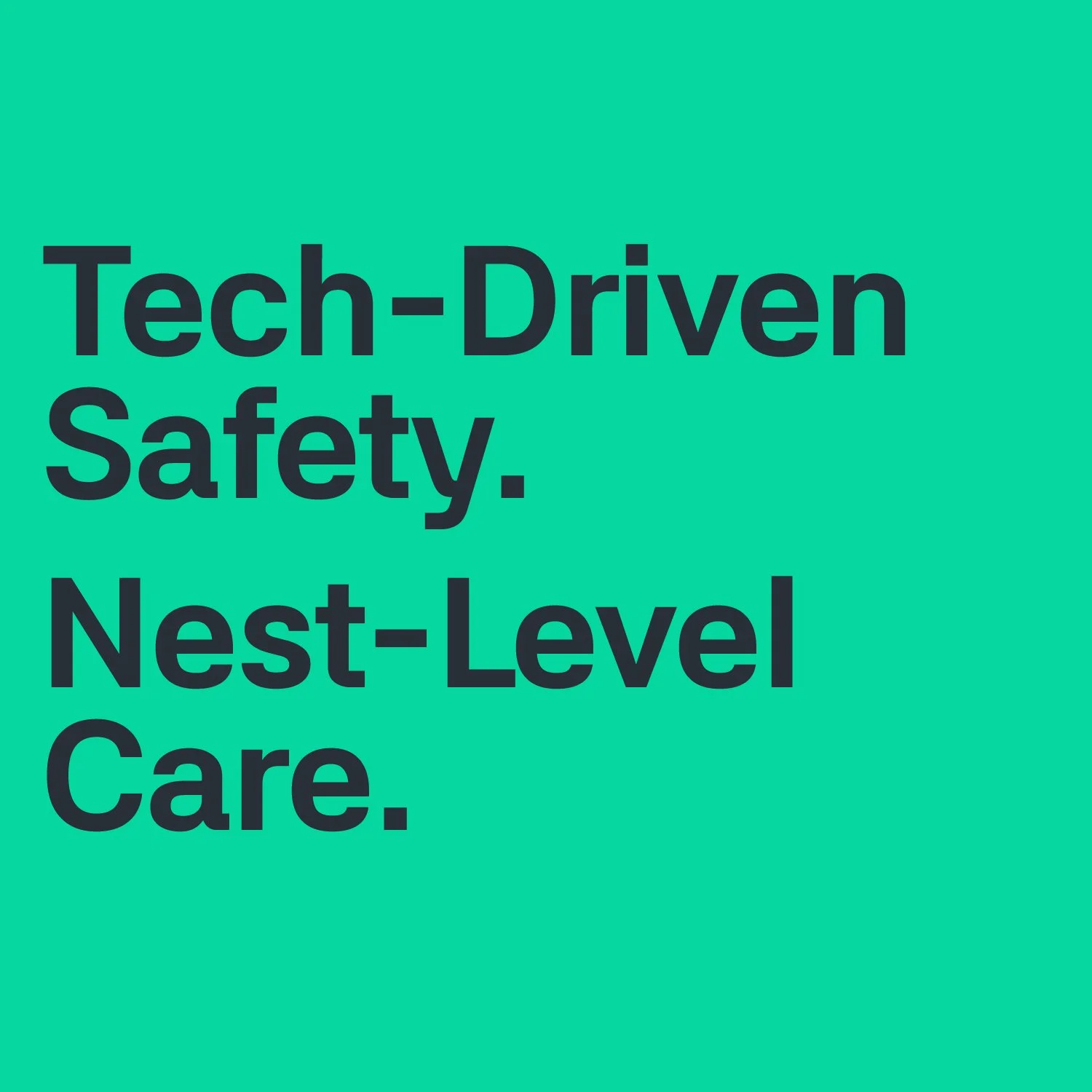
This project transformed one of my logos into a product with a visual identity and branded message. BoltNest develops ultra-secure, modular smart home storage systems designed for urban living. “Smart lockers” for your home. Wall-mounted or bolted compartments that can safely protect valuables, deliveries or personal items.

My Role

Logo, Visual Identity, Website

My Team

Michael Chen - Graphic Designer

Intelligent by Design.
Secure by Nature.

BoltNest was designed as a sleek, dependable product for a tech-savvy audience. To reinforce the brand name and core message, I developed a visual nest-like texture inspired by the way animals protected their homes. A symbol of the security and care for ones personal valuables. Through the contrast of an organic element and a metallic man-made product I hoped to bridge the connection back to nature.

What was the strategy behind the visual identity?

Tech-driven Safety.
Nest-Level Care.

By finding phrases that suggested a more primal instinct when protecting one’s nest, with the assistance of ChatGPT, I generated a few drafts. I then narrowed and edited them down to a few I felt most strongly implied the feeling I was hoping to achieve.

How did you craft the messaging?