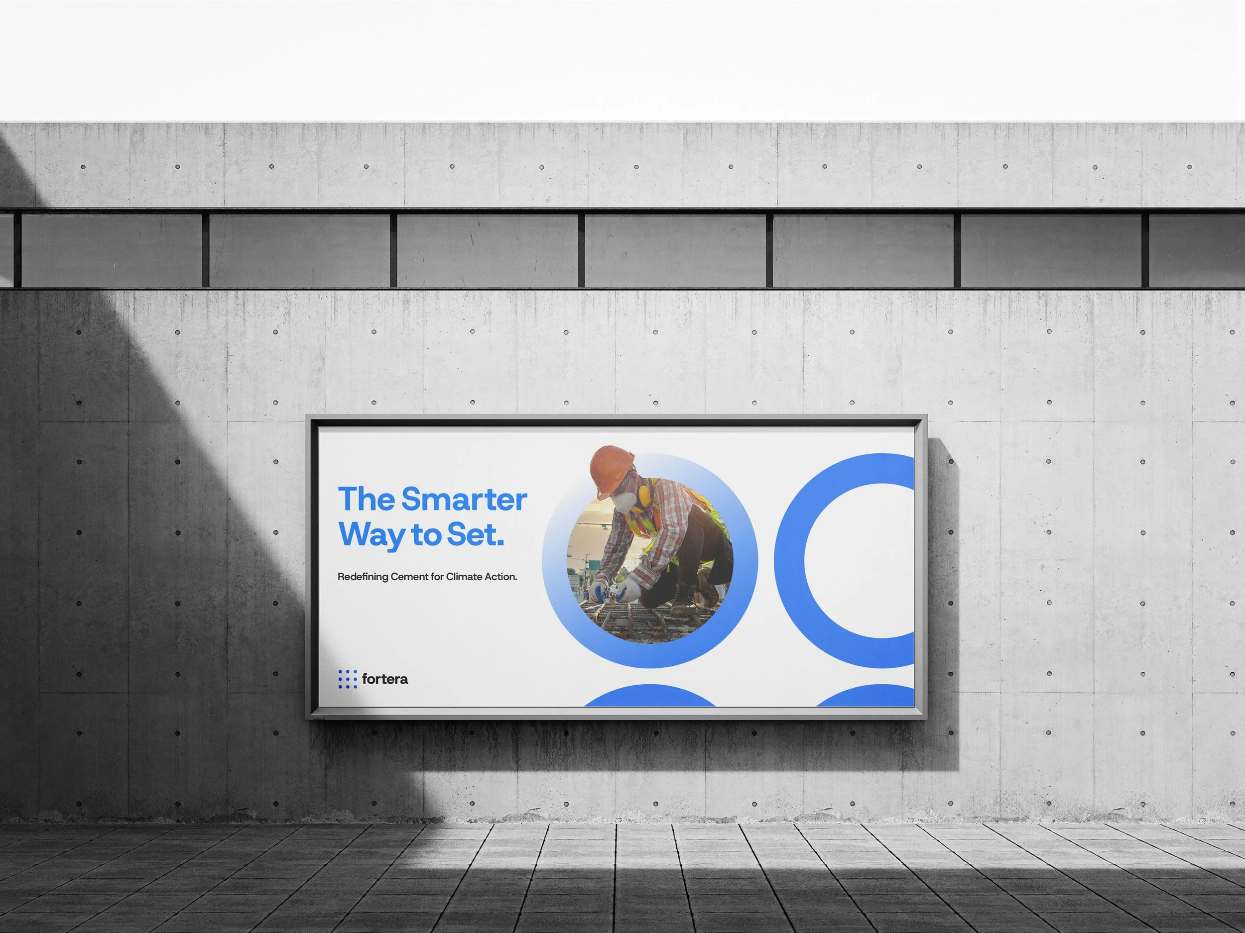
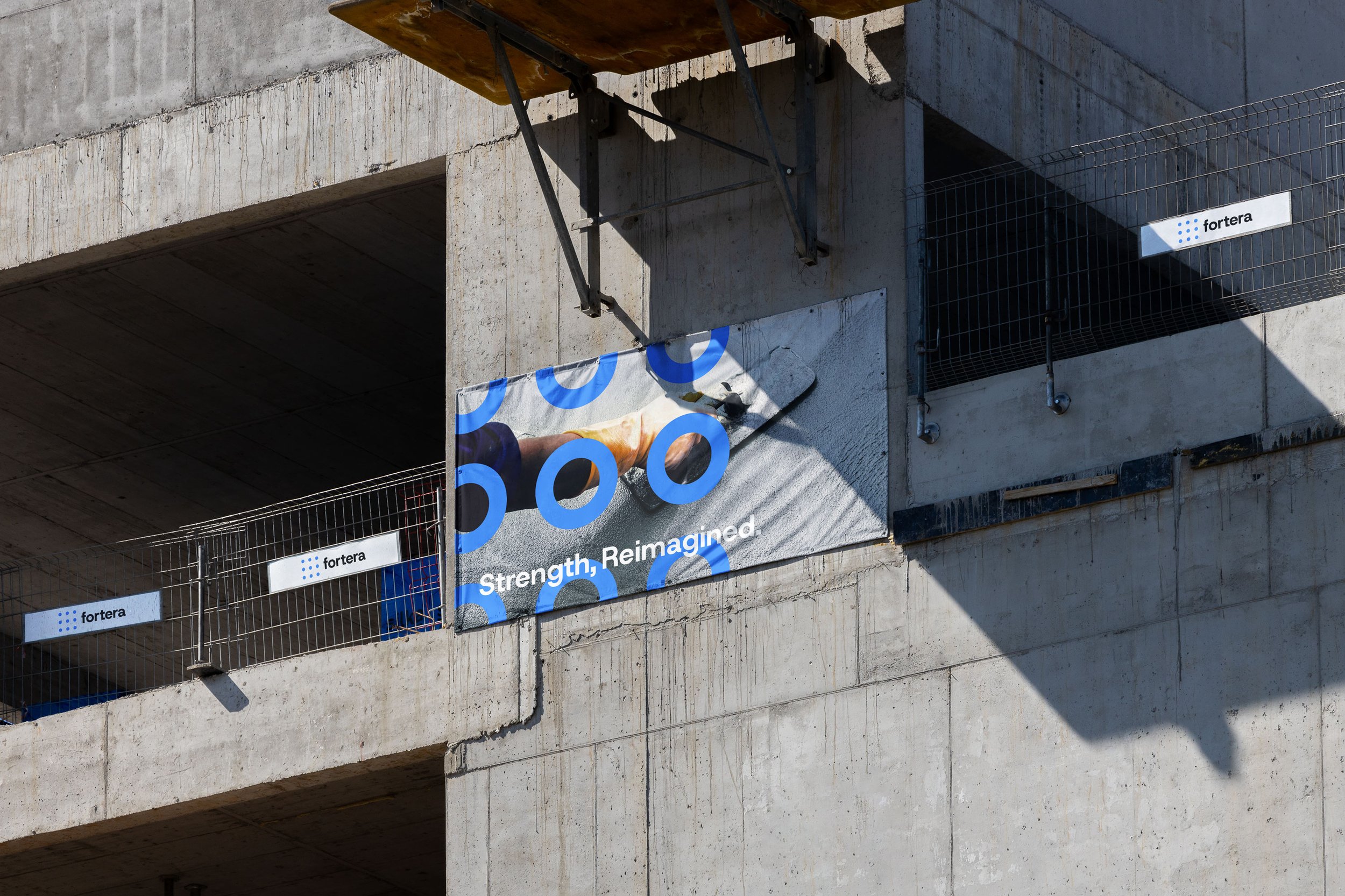
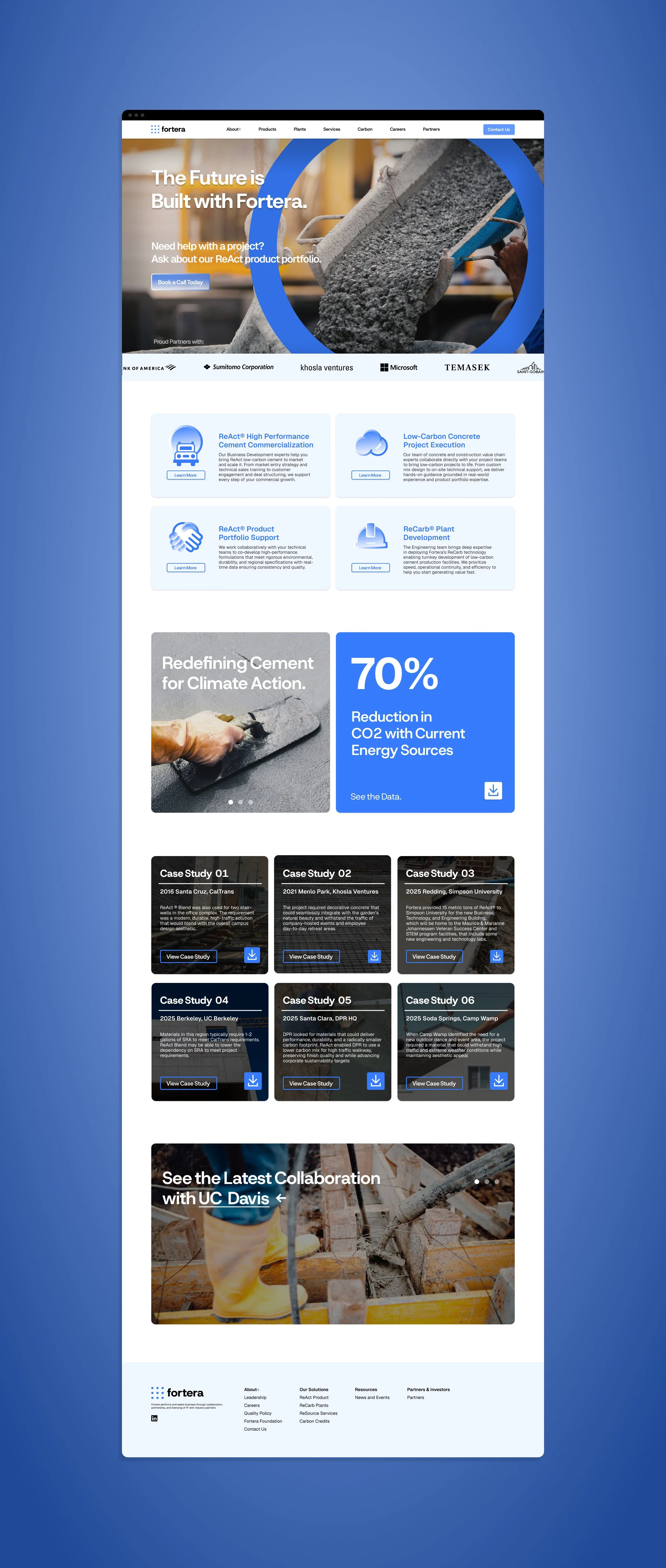
Fortera’s brand went through leadership changes and was redirected several times, drifting from its original concept. This case study aims to reshape the brand around its founding intent: reducing global CO2 emissions and becoming a leader in the cement industry.
Team
Michael Chen - Graphic Designer
Illustrator
Figma
Photoshop
After Effects
Brief
Redesign the Fortera brand around its founding purpose: reducing global CO2 emissions. The new brand should emphasize the impact of solving this problem and explain, in plain terms, why the technology matters. Through its messaging, visual identity, and tone, Fortera should come across as a problem-solving innovator and a leader in sustainable cement, helping decarbonize the industry.
The Challenges
Fortera’s current branding lacks cohesiveness, with messaging, visuals, and product names that don’t consistently reinforce one another.
The brand does not yet look built for global growth, which makes it harder to signal the scale and ambition of its mission to international partners.
The target audience is unclear, since the brand speaks to contractors, cement producers, corporate buyers, and investors without a clear path for each.
The Solutions
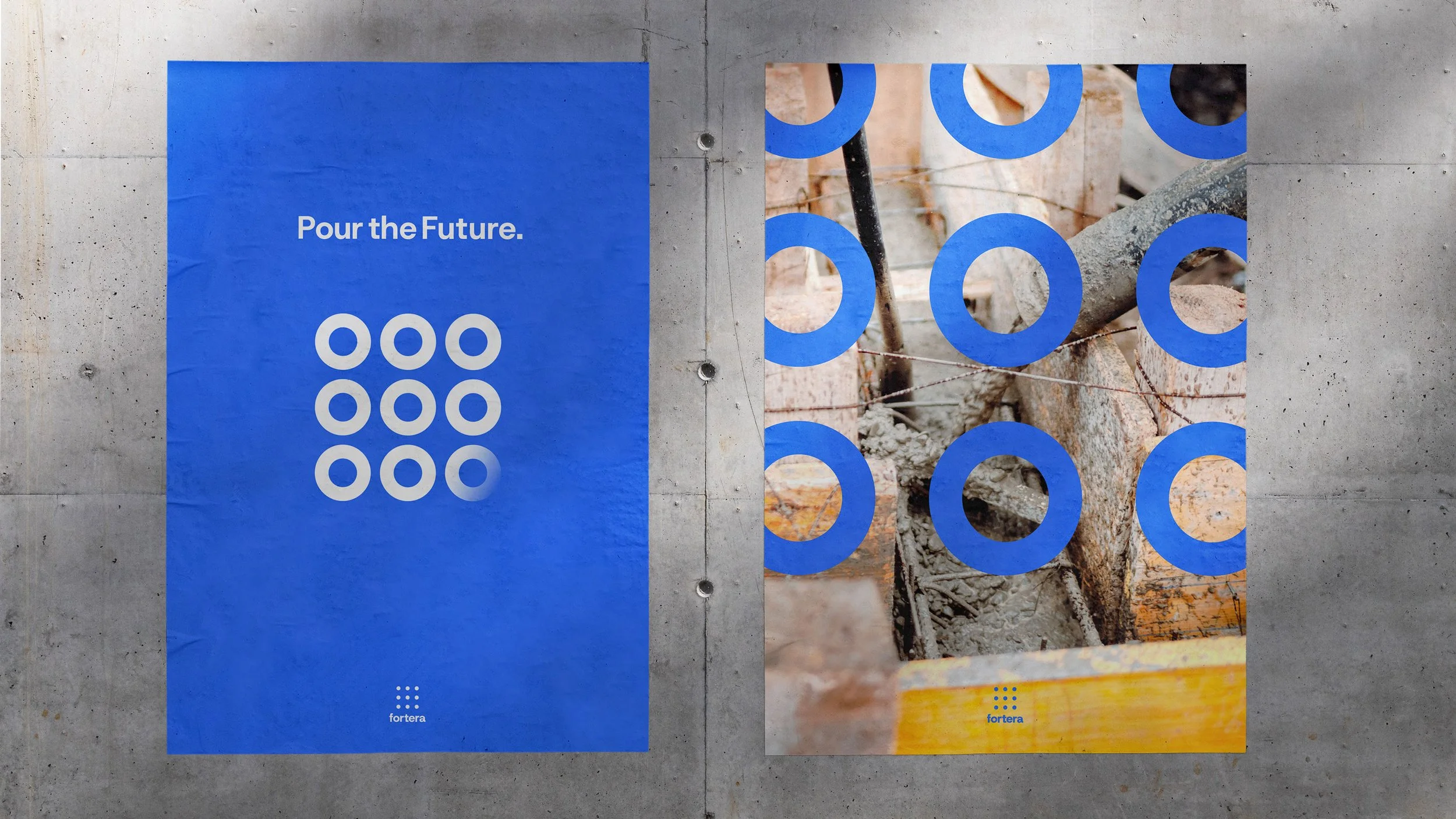
Narrow down the visuals into a shape that is more recognizable and consistently applied throughout.
Keep the color palette simple but meaningful and with chosen with intent.
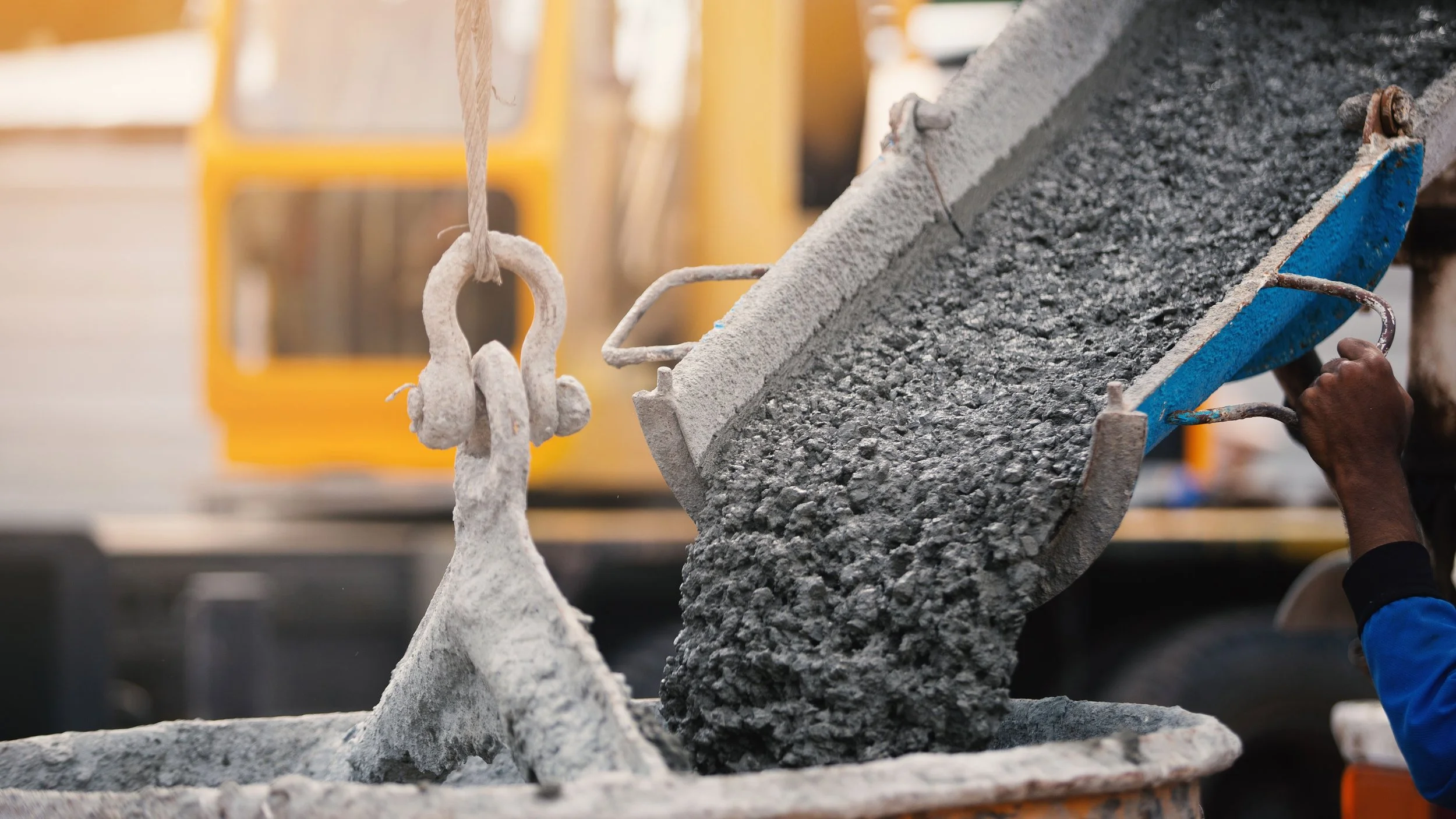
Continue use of “real” photographs that show real word impact.
Use of more motion and animation.
Pinpointing Issues
The brand messaging lacks a clear mission, leaving the goal of reducing global CO2 emissions buried rather than front and center.
The color palette is inconsistent across materials, which weakens recognition and makes the brand feel less polished.
The brand has no visual design system, so there are no shared rules for typography, color, imagery, and layout to keep future work consistent.
Design Inspiration
White was a recurring theme I identified, representing what makes Fortera’s product unique: a limestone-based cement with minimal additives that produces a whiter finish. Blue represented the future and the hope the brand wants to achieve through its sustainability efforts.
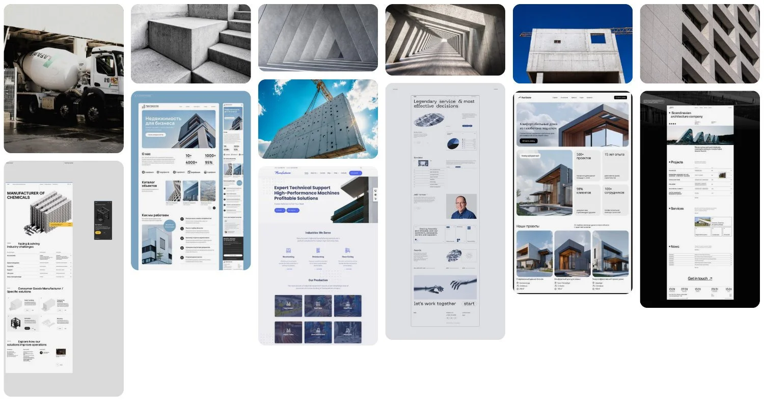
Design Tools
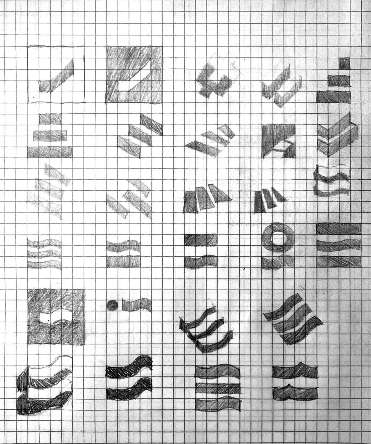
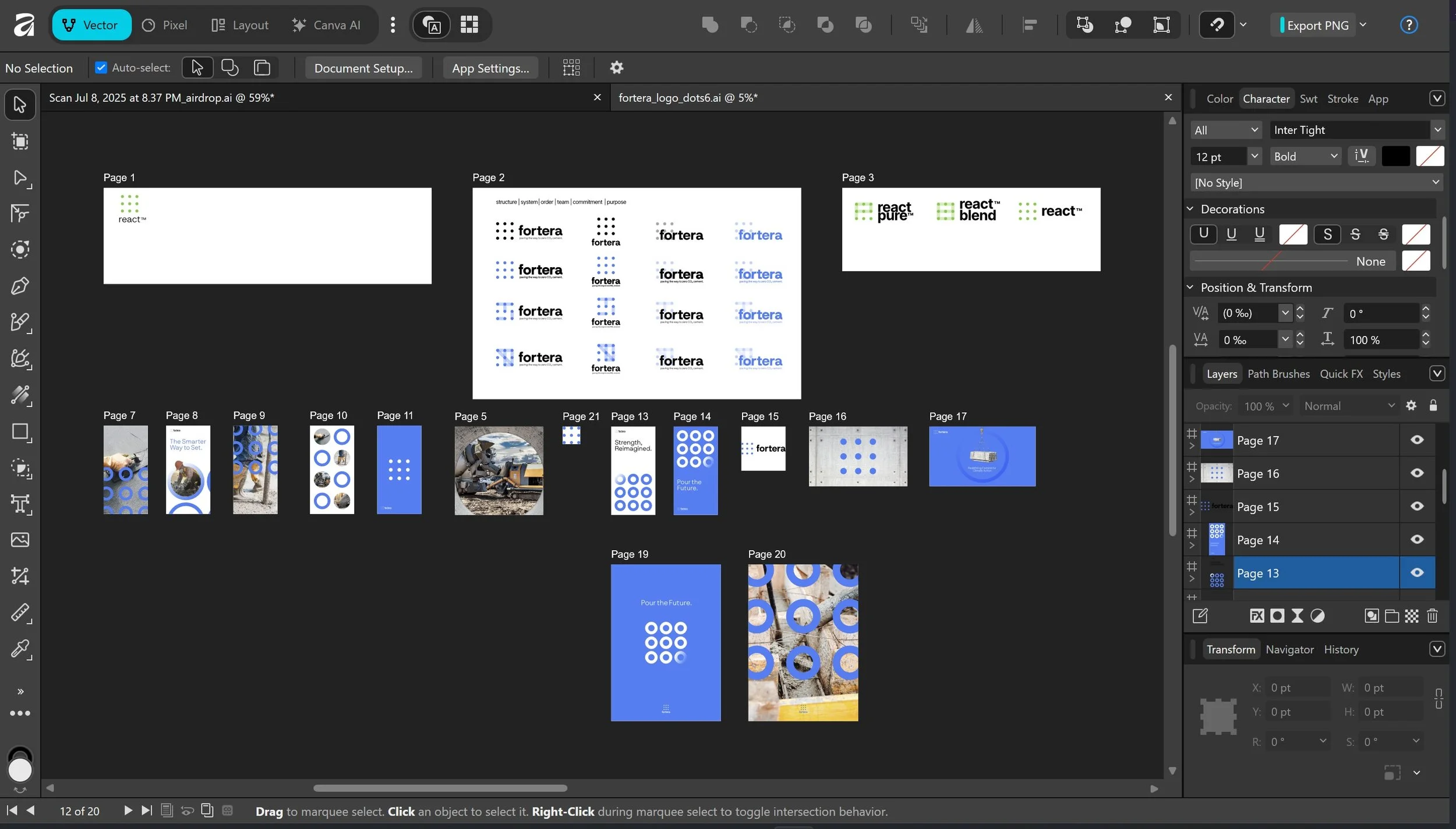
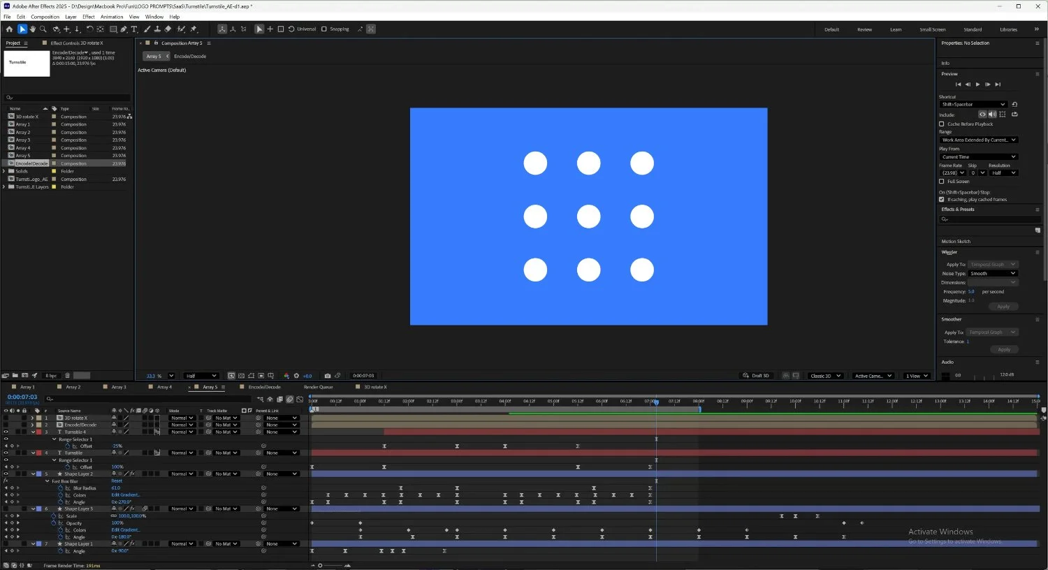
Starting with sketches, I gradually introduced digital elements, moving into Illustrator and then Photoshop to complete my mockup images. I created all of the motion in After Effects to bring the brand to life.
Pen and Paper
Illustrator
After Effects
Photoshop
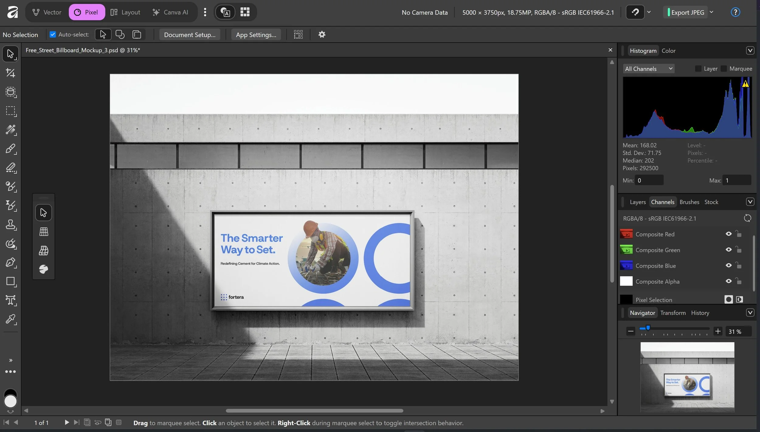
Visual Design
Blue became the primary color to represent looking forward to the future. Green was chosen as symbol for sustainability. These visuals were built around a set of keywords chosen for the style I wanted to achieve: structure, system, order, team, commitment and purpose.
Logos
Main Logo
Typography
Host Grotesk

Geist

Iconography

Visuals
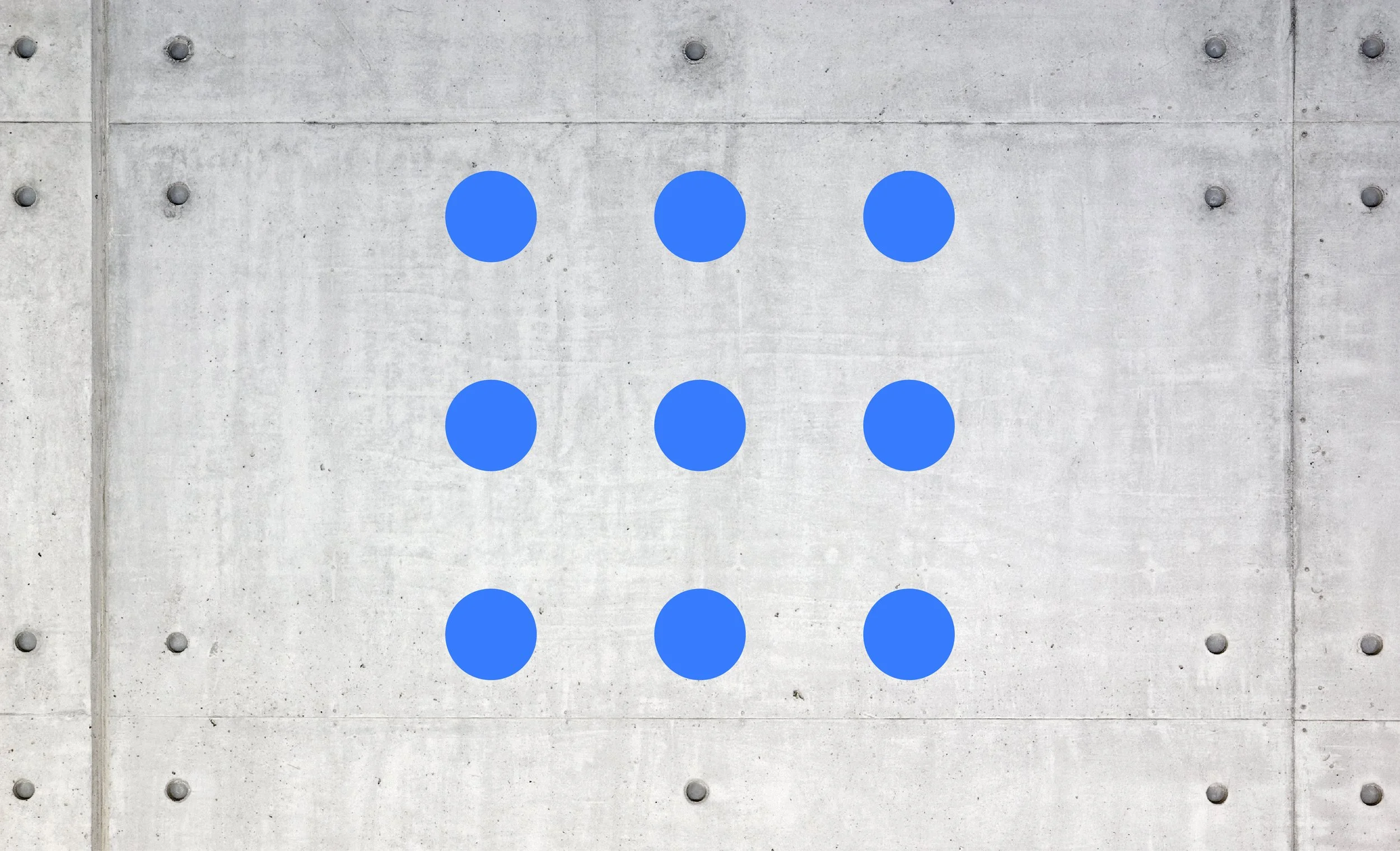
Circular Vectors
Circular Imagery

Product Logo
Product Type 1
Product Type 2